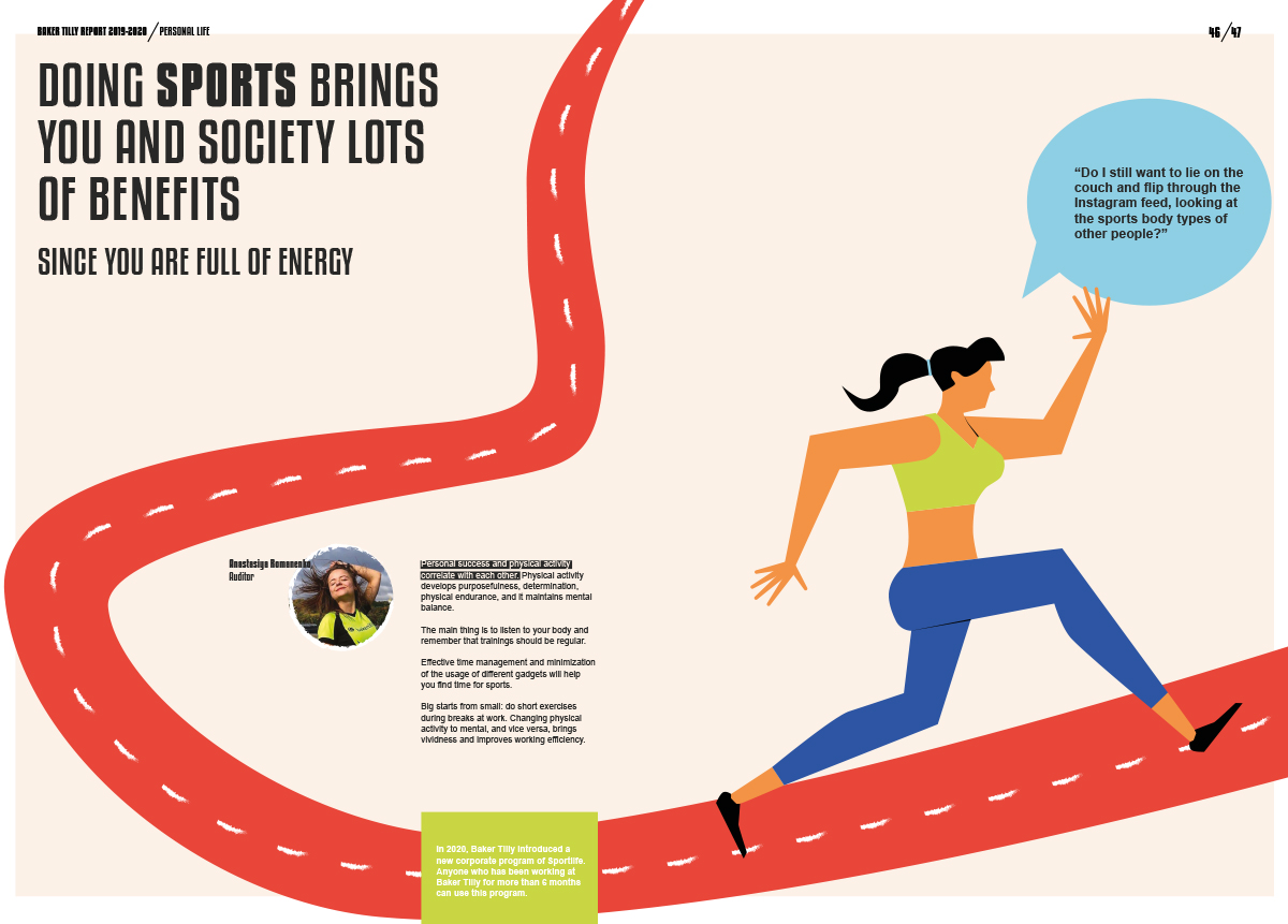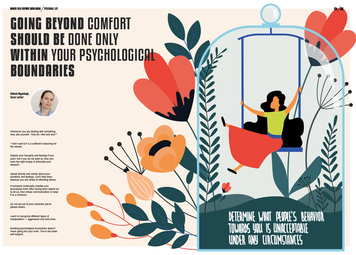
Baker Tilly is a global accounting firm and their 2019/20 report works actively to break public perceptions of accounting. The report is upbeat in tone and visually quirky. Either that or it’s frantic, depending on your design sensibilities.
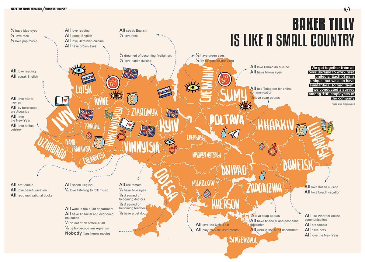
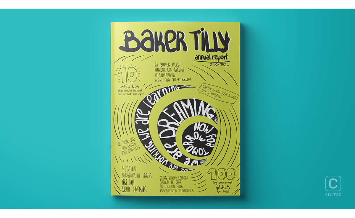
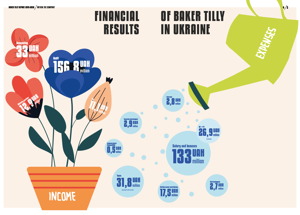
The report uses about five typefaces, some of them very friendly, some very businesslike. Most spreads are a visual barrage of colour and illustration. Thematically, the report tries to make accounting cool but it also wants the reader to think of a career in accounting as a lifestyle. The content is modeled around advice for a healthy life, section titles being a particularly good example.
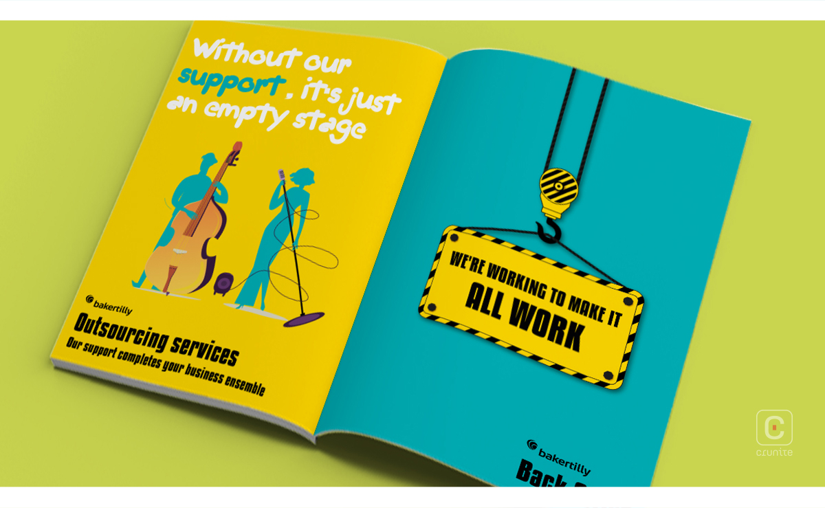
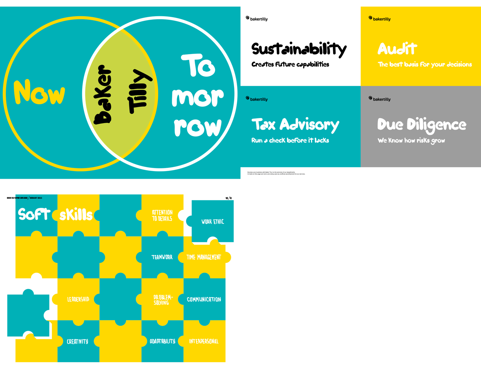
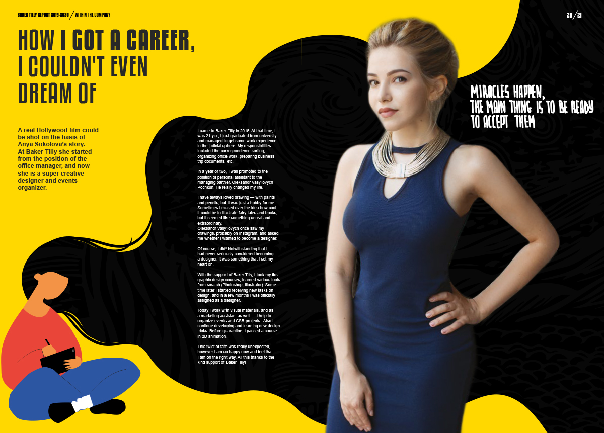
The visuals reflect this lifestyle-promotion in such a way that if you knew nothing about Baker Tilly, you might assume it was a lifestyle brand or a particularly energetic wellness centre. There isn’t a single person wearing a tie. Everyone is attired for partying or relaxing. There is an illustration of an employee in a dinosaur suit.
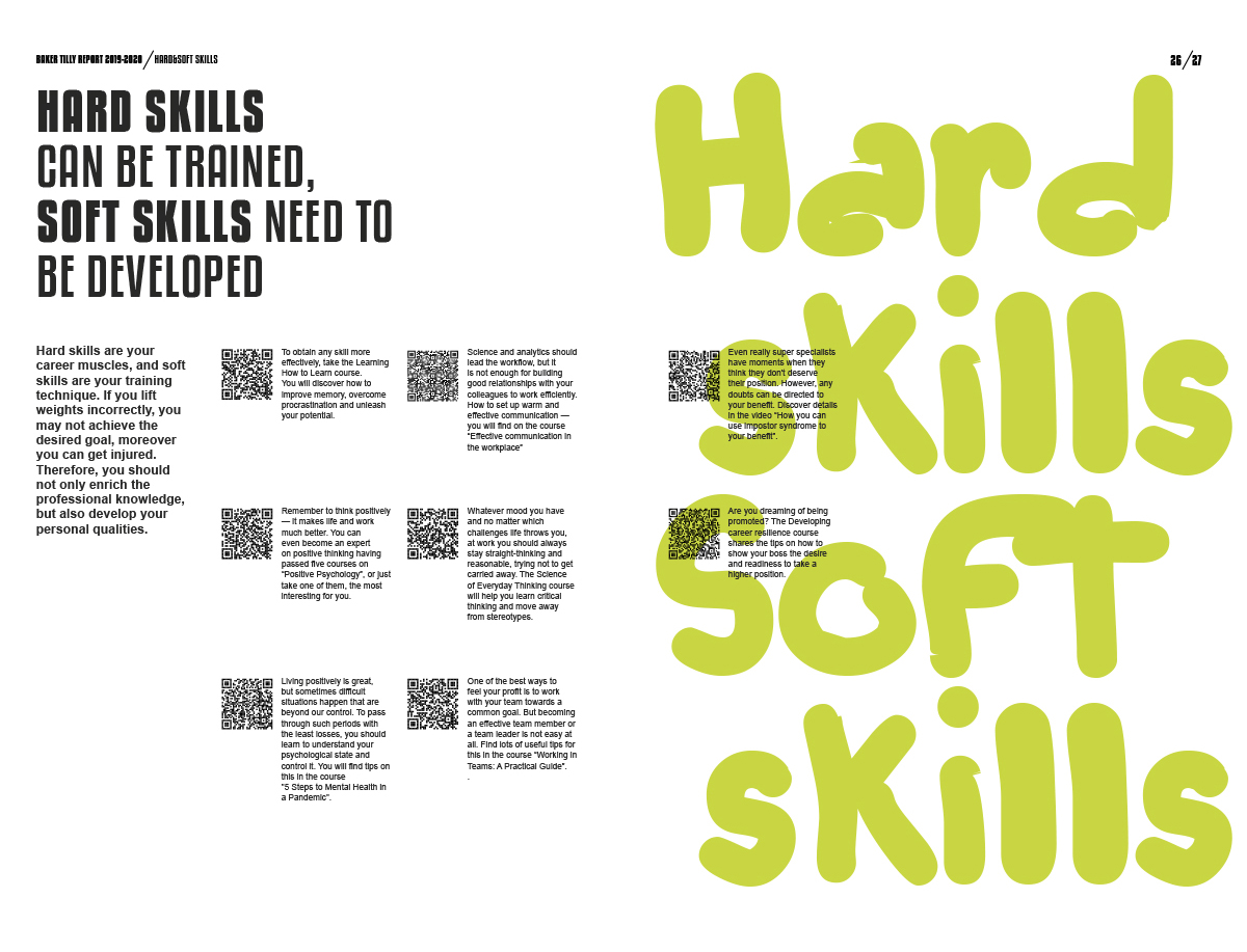
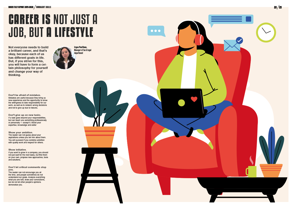
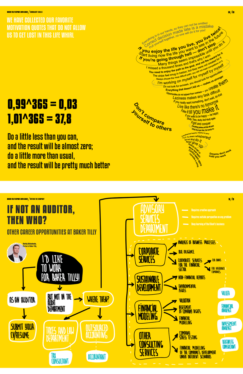
This report is worth studying as a way to understand how all the elements of an annual report’s design can be meticulously stitched together. Everything from the tone of voice in the text, to the iconography, to the carefully selected pictures of employees enjoying themselves – all of it works cohesively to accomplish what the report sets out do – change how you think about accounting.
