The highly active government-funded Art Council of Korea (ARKO) promotes Korean arts by supporting artists and arts organisations, and by promoting international cultural exchanges (see our review of their 2021 annual report).
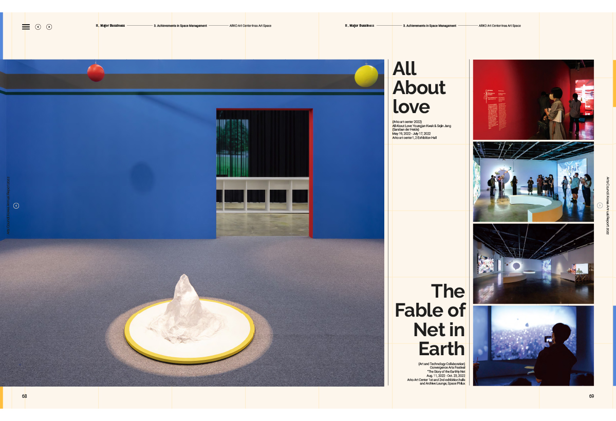
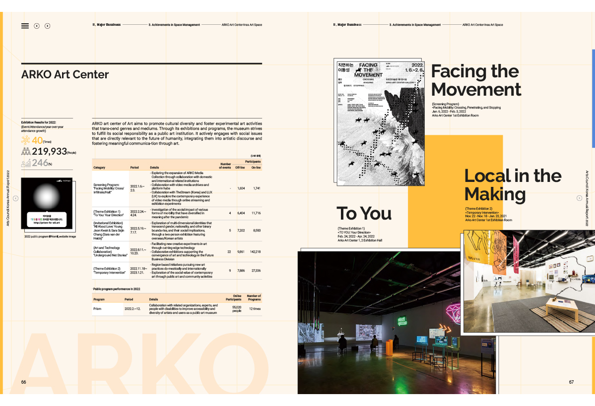
ARKO’s 2022 report shares a number of similarities with their 2021 report, most notably in how it handles information density per square centimetre. The current report is even cleverer in the way it packs data into the layout.
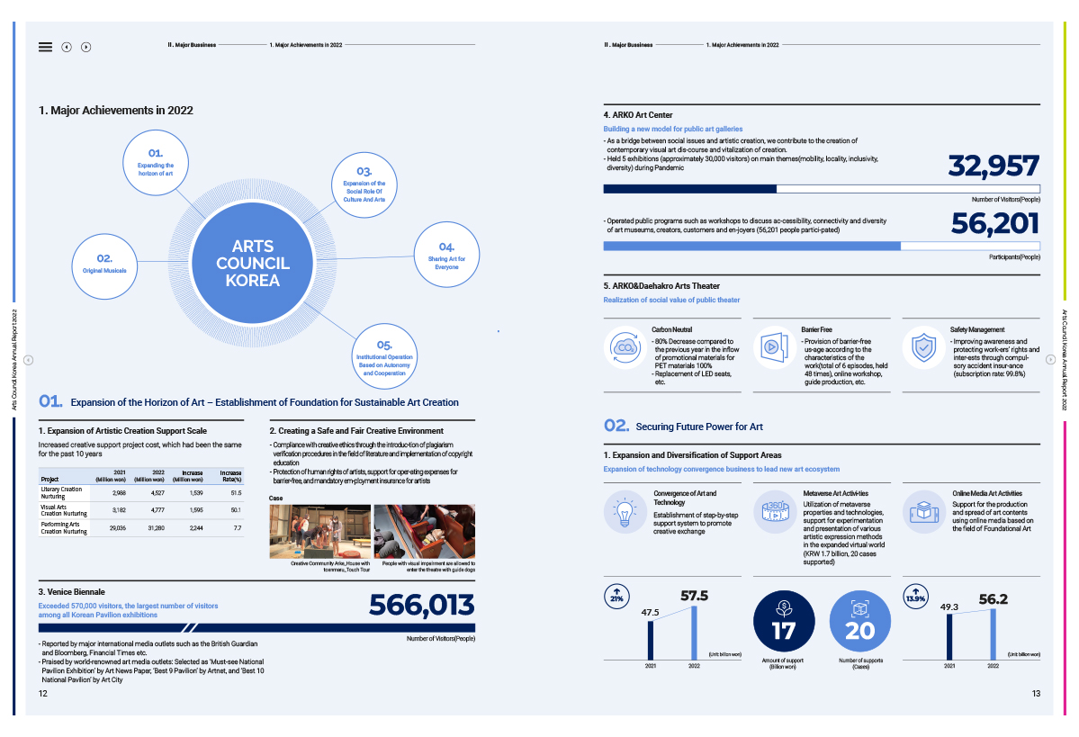
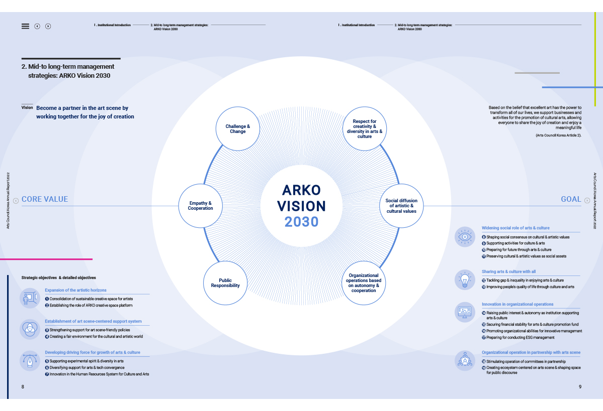
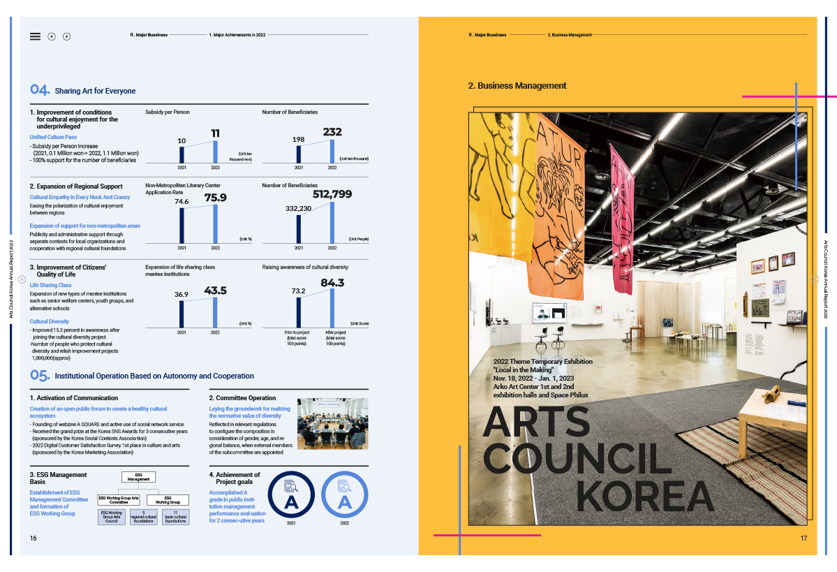
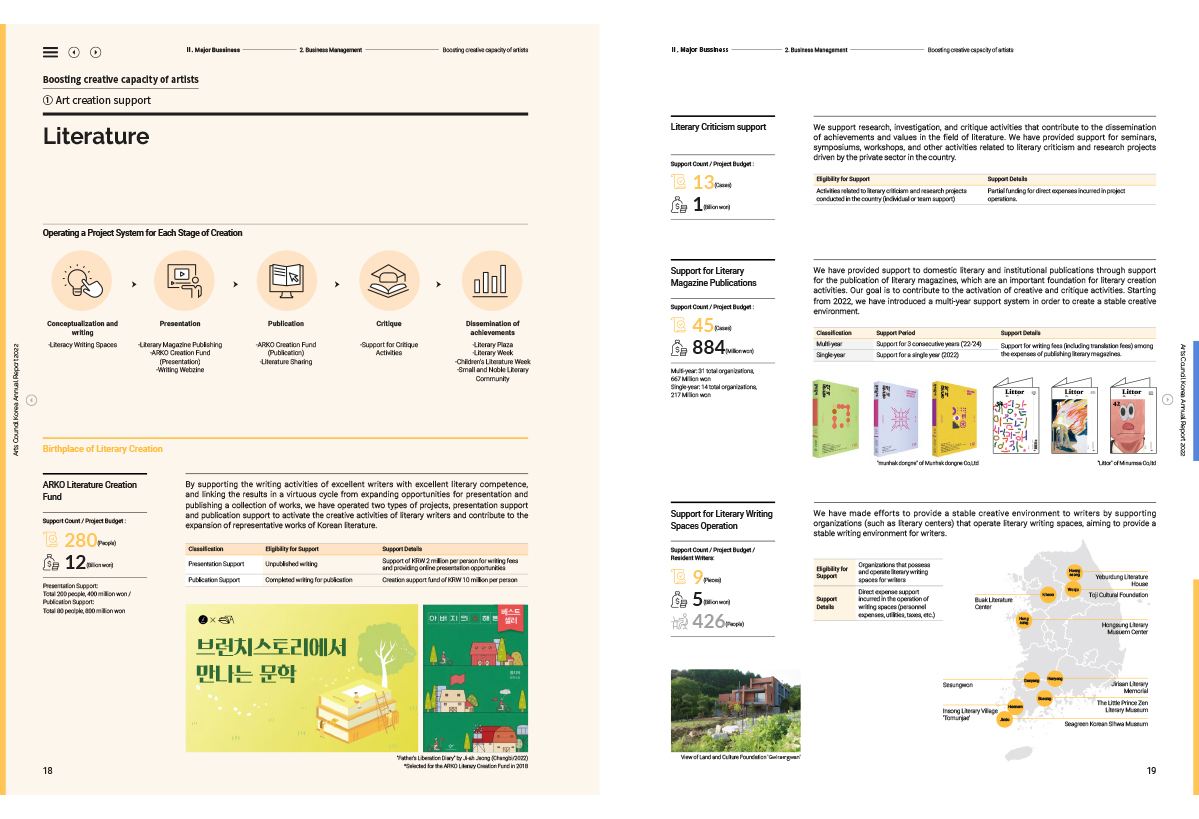
Part of this happens through the skillful handling of typography. An easy to read sans serif in multiple weights and sizes does a lot of the hard work here, and it is typeset with careful attention to leading and tracking.
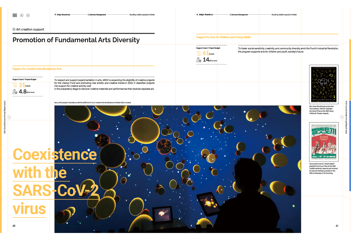
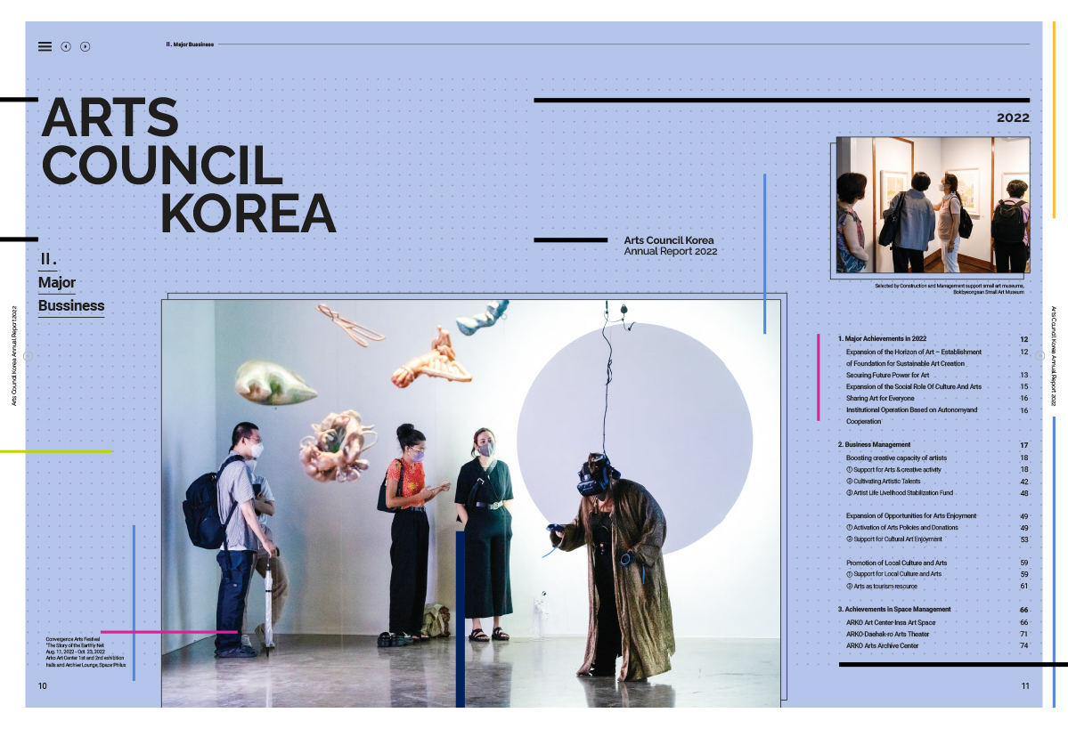
Part of it (perhaps the major part) is the astute use of page grids. The 2022 annual report makes use of a flexible grid that appears, variously, as a 2-Column Even grid, a 3-Column Even, a 4-Column Even and, as a 2-Column Uneven. This latter is really the 4-Column grid, made by combining three of the four columns.
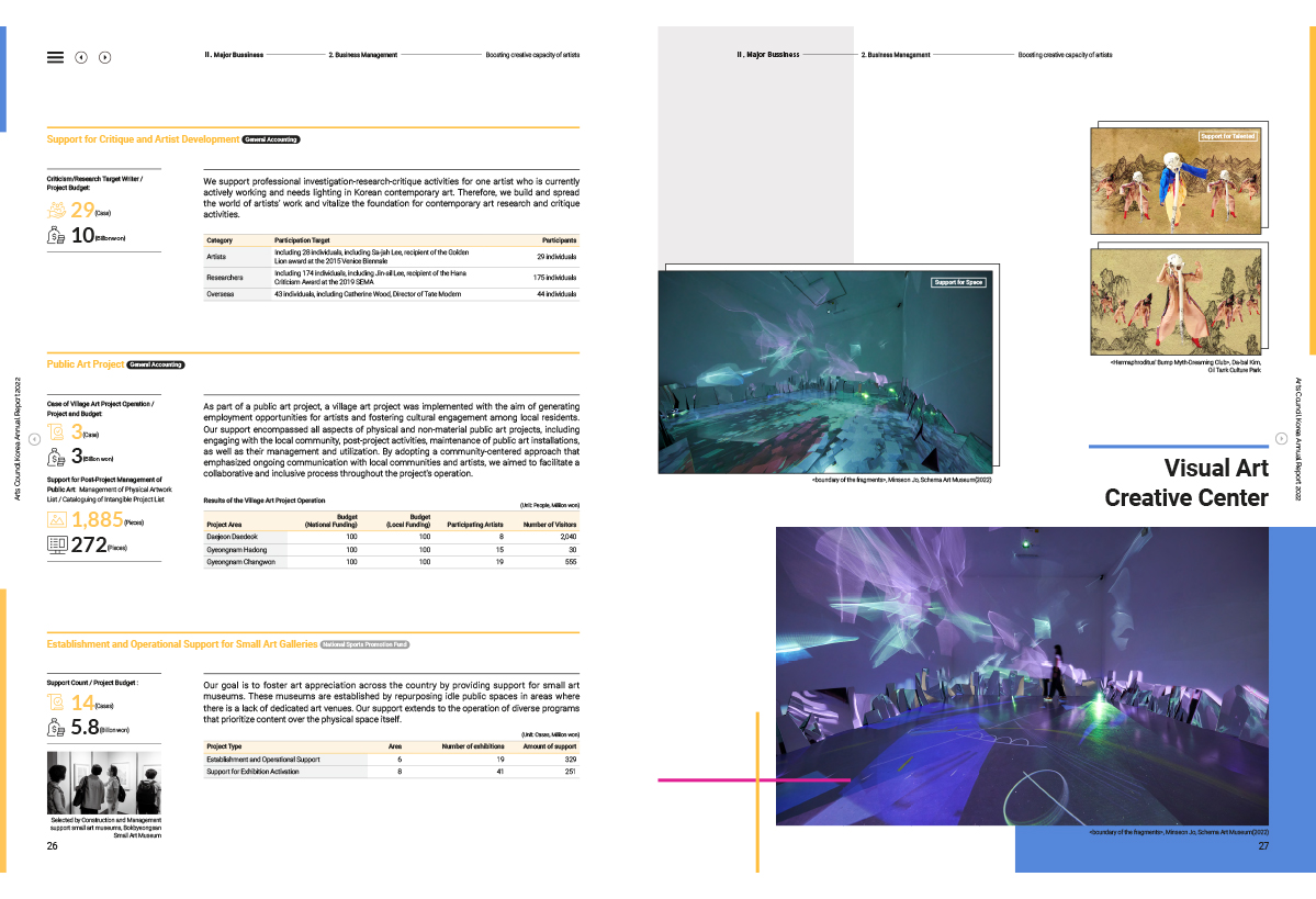
This 2-Column Uneven grid creates a narrow column on the left-hand edge of a page. The column carries charts, graphs, icons, numerals or photographs formatted neatly to fit the space. And most importantly, very little else appears in this column – it is not, for example, filled up with text. So although the narrow column in the 2-Column Uneven grid carries more than its share of data, it never feels packed.
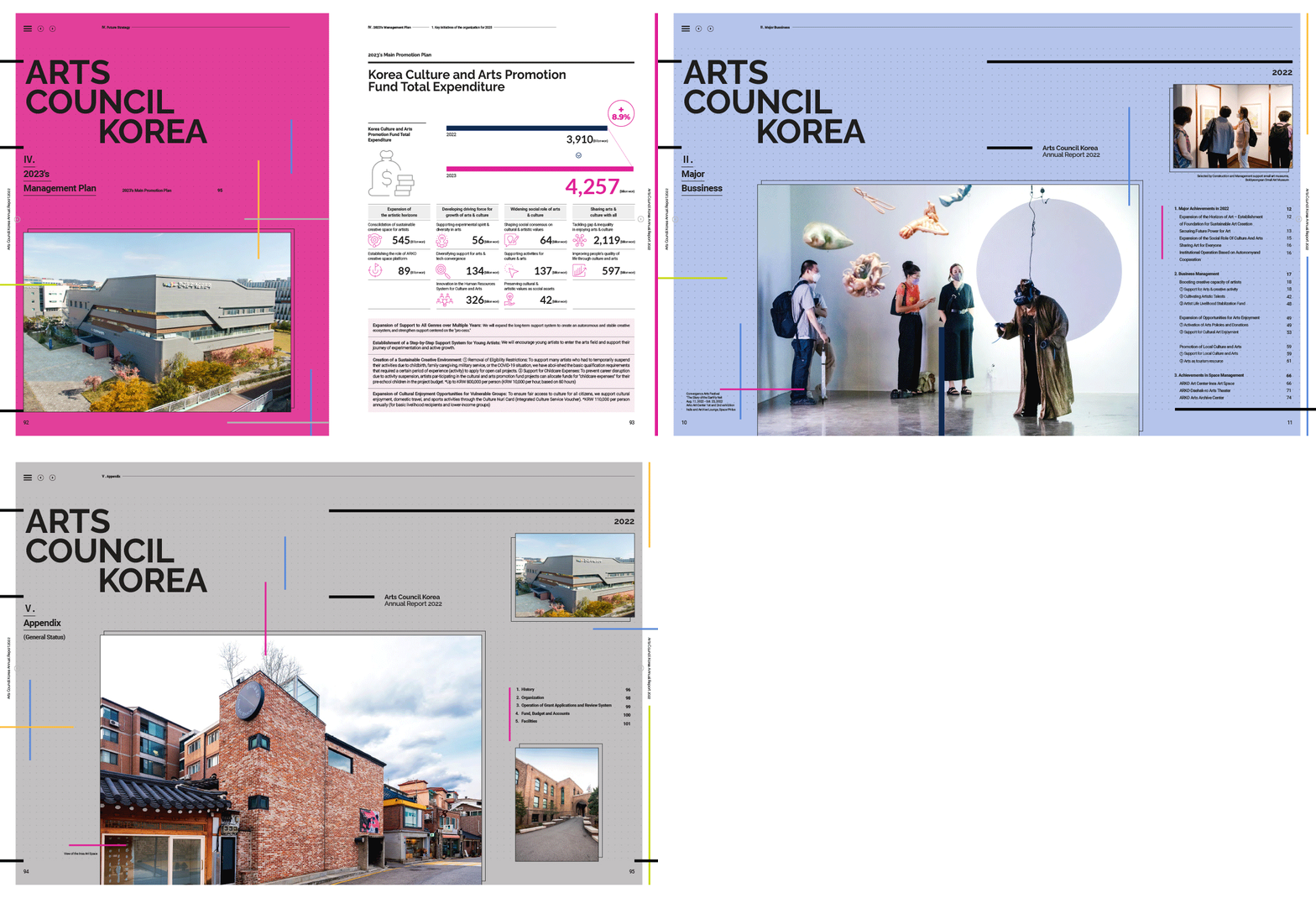
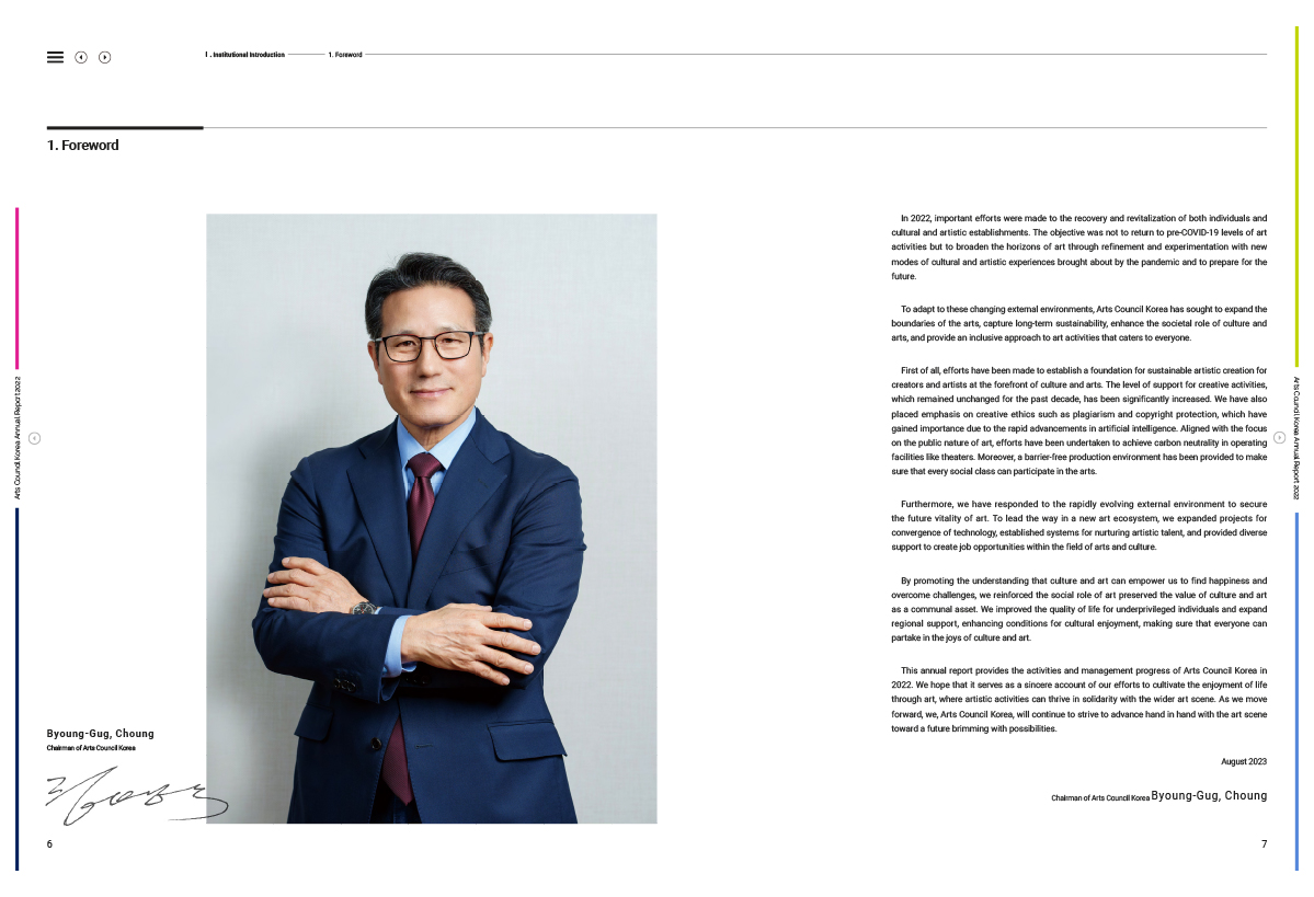
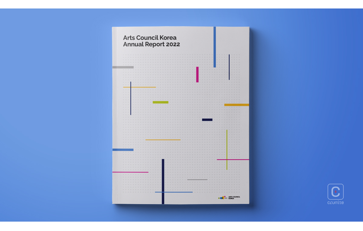
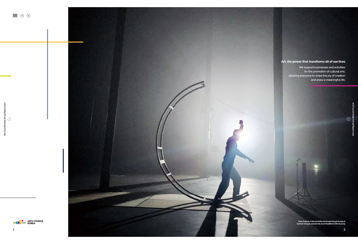
In terms of its visual elements, the report is reminiscent of the kind of 20th Century Abstract Art that Piet Mondrian was famous for. It suits the page design perfectly and makes great use of a limited colour palette, too. In how it handles, compresses and displays data, this annual report is one worth studying.
