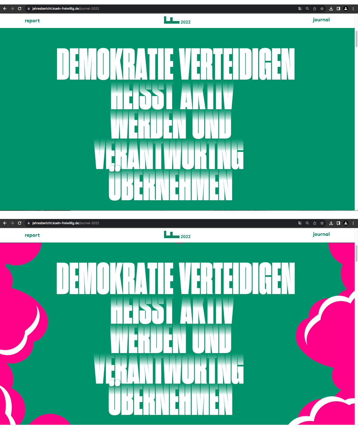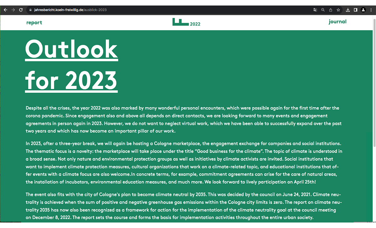
The Cologne Volunteer Agency is a 25-year-old organisation that promotes democracy and places volunteers where most needed whether in short- or long-term situations. Much of the CVA’s work in 2022 revolved around Ukrainian refugees and growing anti-democratic sentiments in Europe. Their 2022 report is a study in the use of typography and colour.
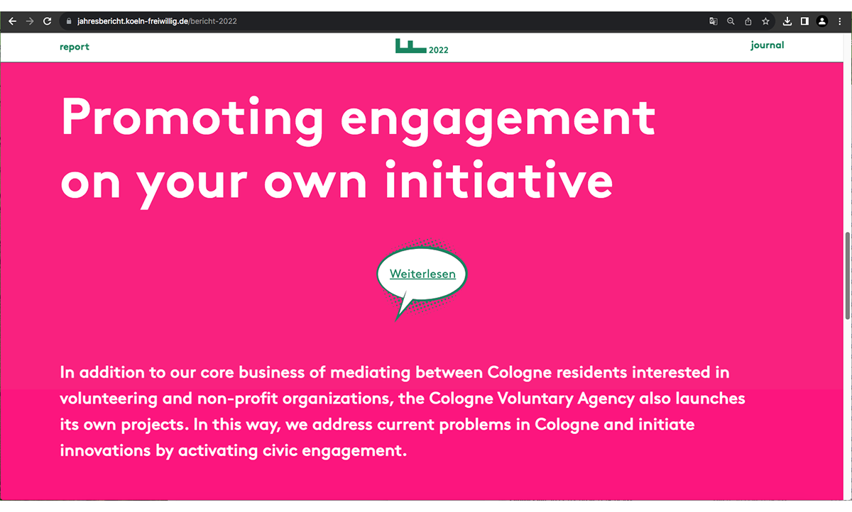
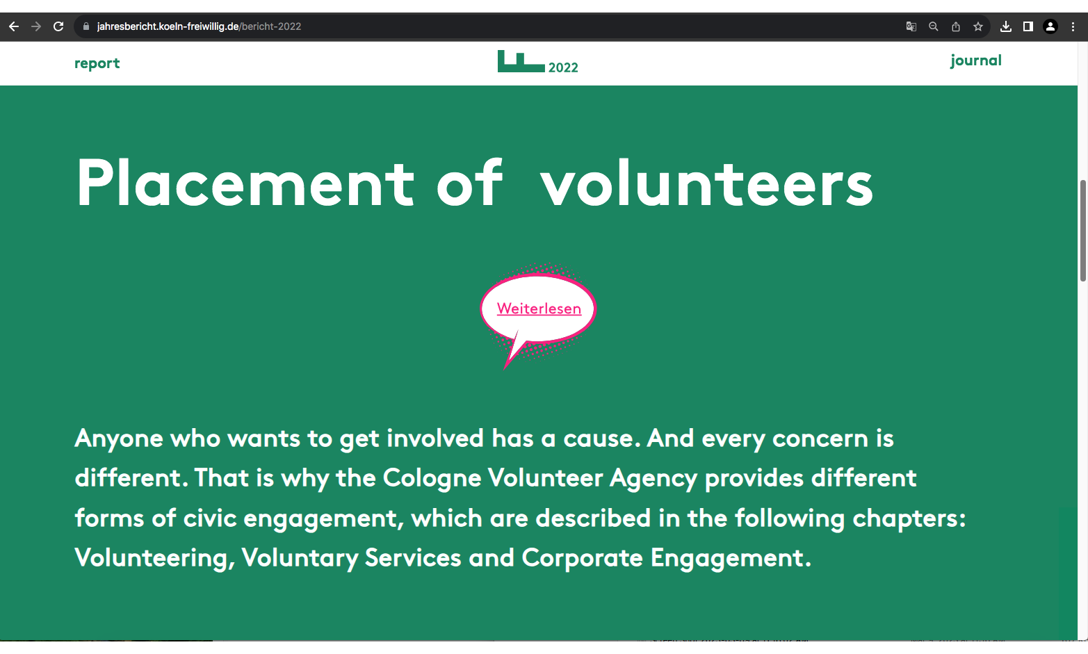
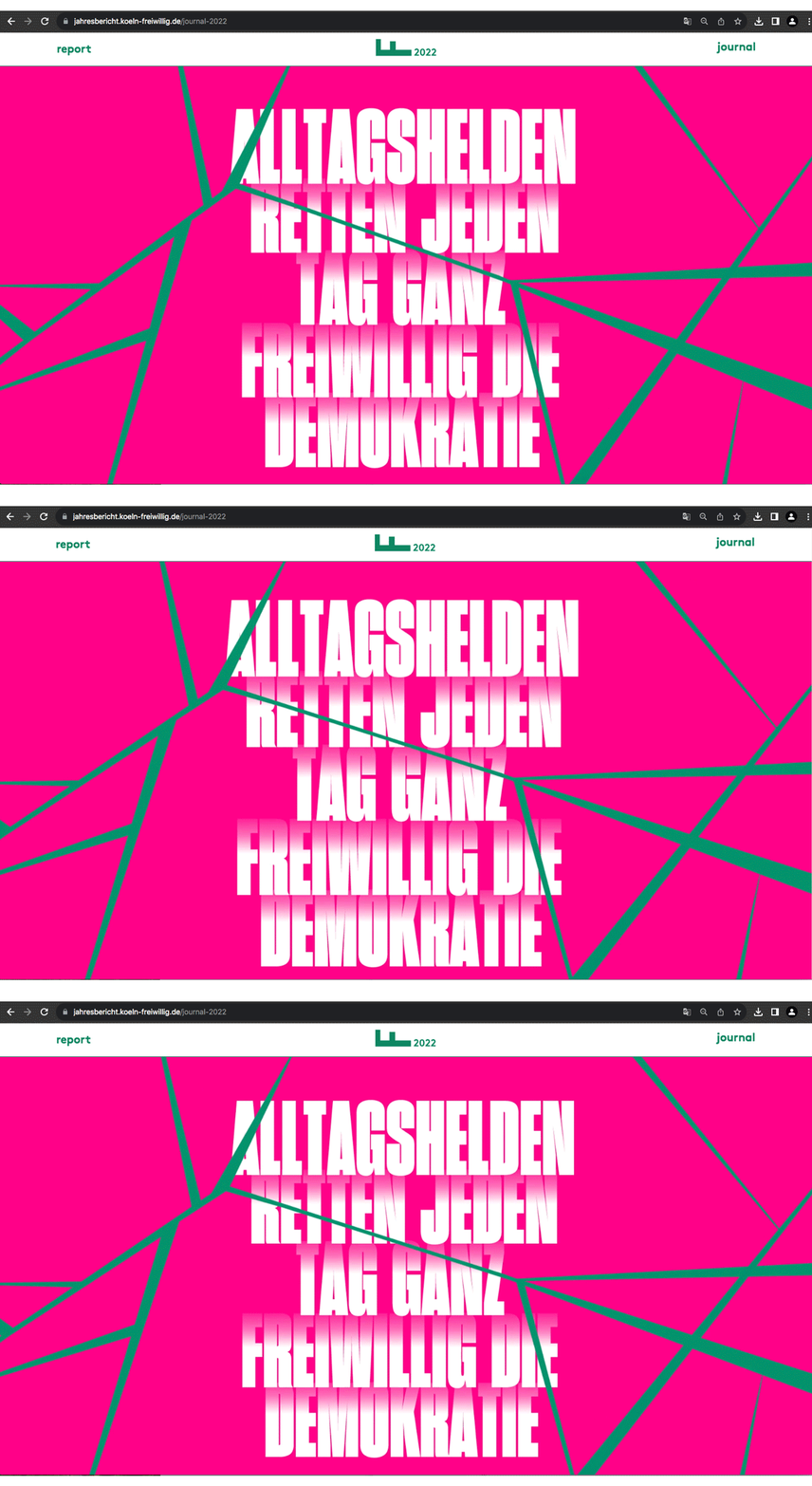
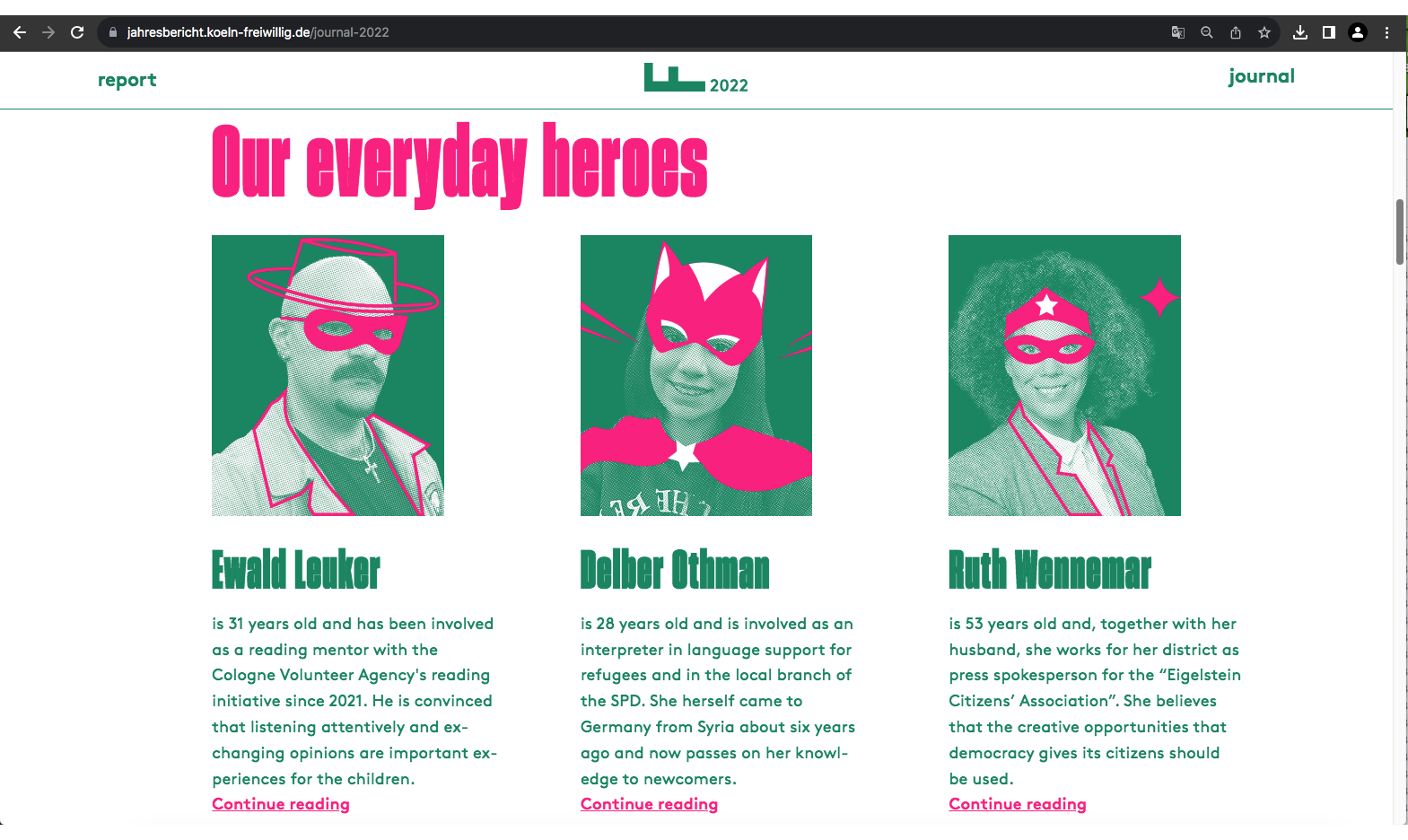
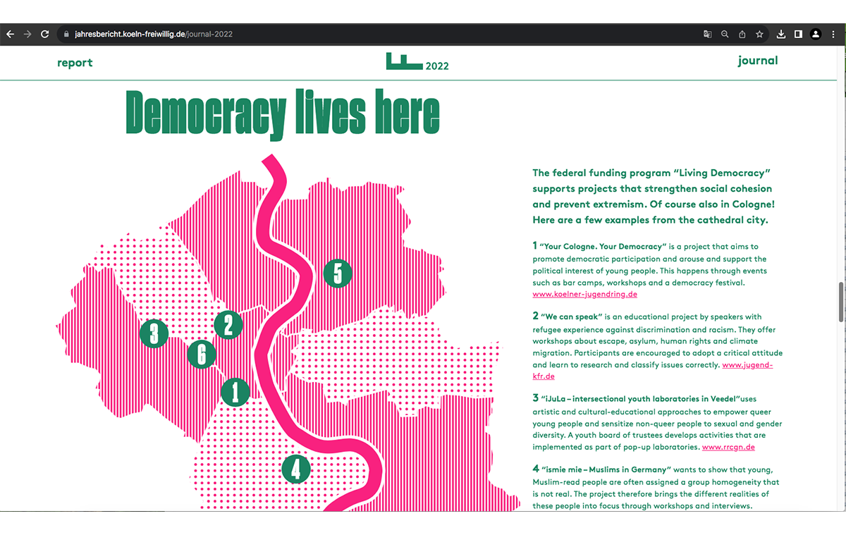
The report (and its other half, the ‘journal’) rely almost entirely on type and colour to convey its message. There are only a handful of images – a few portraits and a map. This is highly unusual for an annual report. As a publication category, the annual report is fundamentally an exercise in visual storytelling –charts, photographs, illustrations, icons—annual reports run the full gamut. The Cologne Volunteer Agency shows how the prevailing design ideology can be rejected and still produce memorable work.
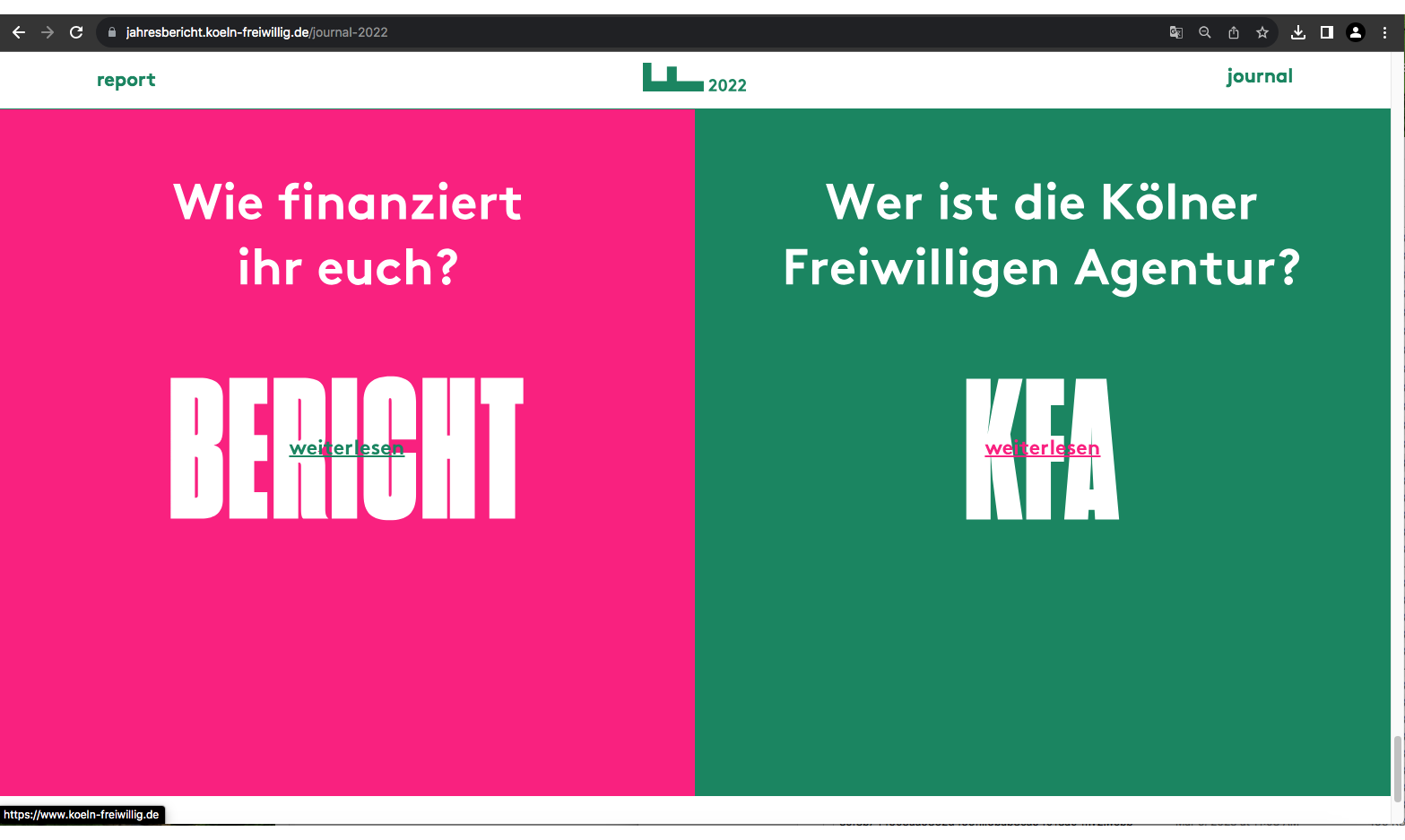
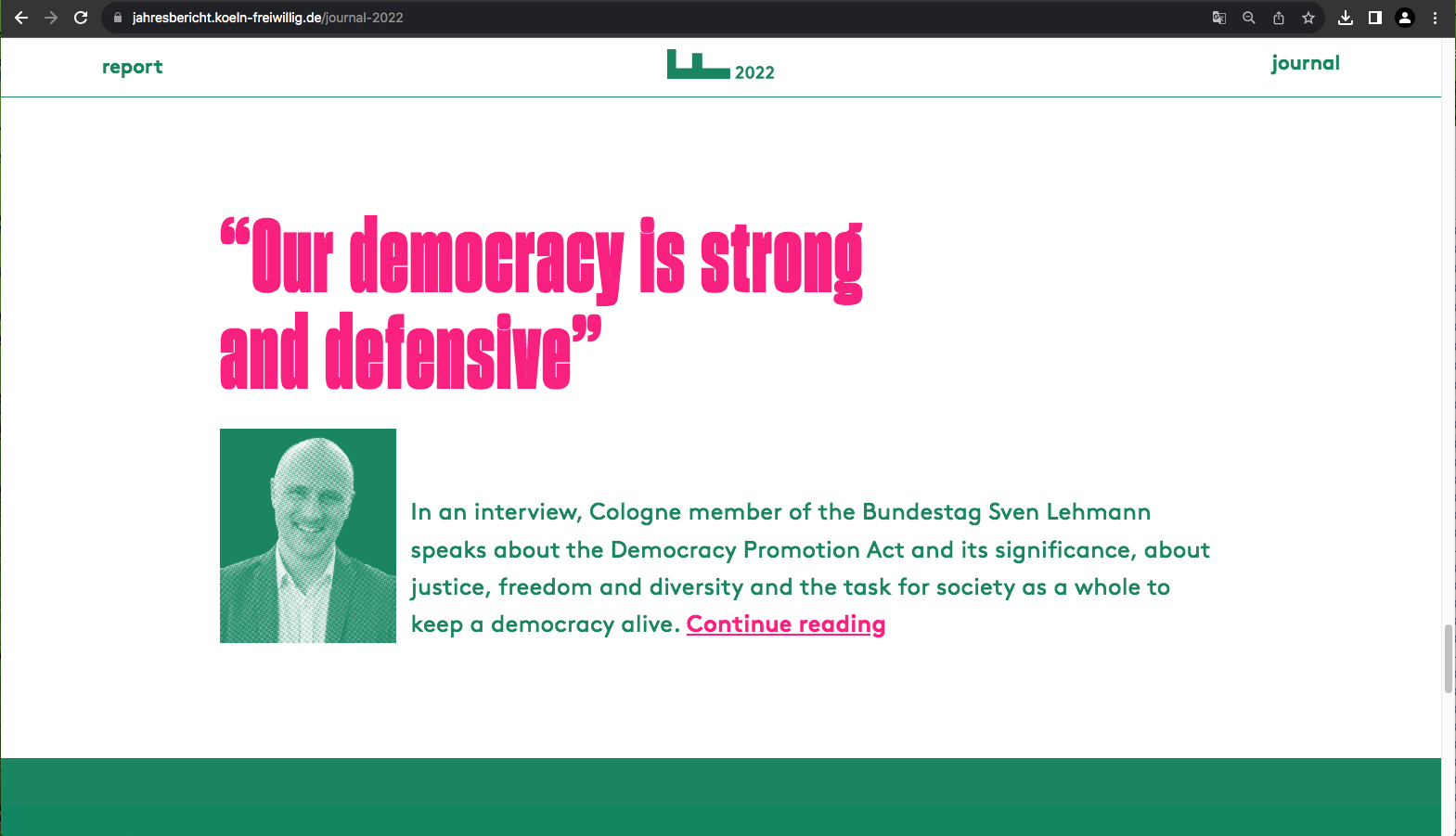
The report uses a 2-colour palette, two sans serif typefaces and limited motion graphics. The grid is simple and effective (except for pull-quotes which sometimes obscure the credit under the quote). Type is set purely for ease of reading. Since the text does not need to adapt itself to the placement of pictures or other visual devices, it runs the width of the screen and given it’s size and weight, is easy to read. Links within the report allow the reader to explore additional information like the CVA’s main website.
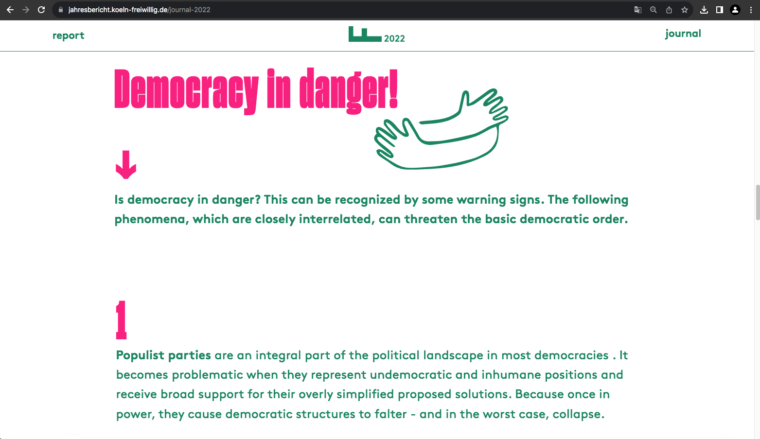
Cleverly constructed, this report is proof that design restrictions can produce striking, effective results.
