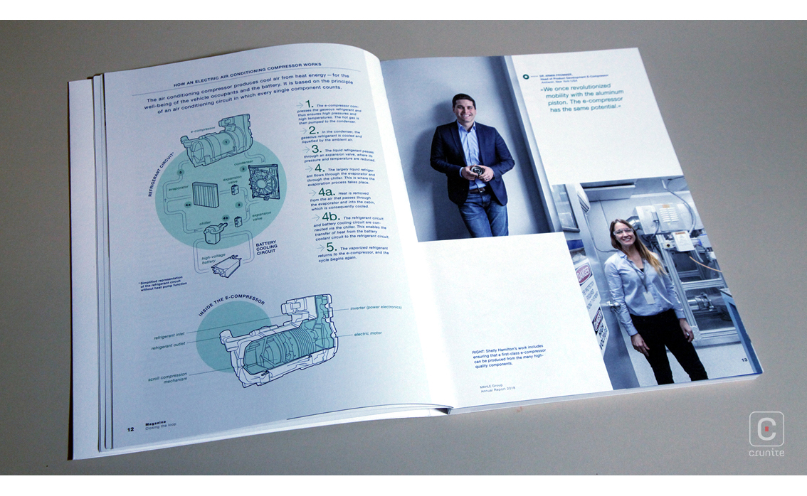
Mahle is a German company that makes automotive parts. In its early days in the 1920s when it went by the fantastic name ‘Elektrometall’ the company made a series of breakthroughs in piston design and hasn’t stopped innovating since.
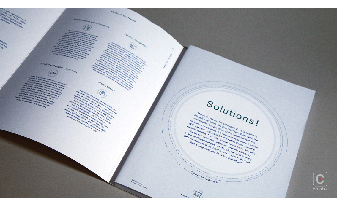
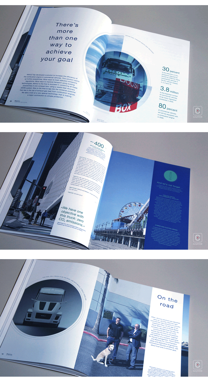
Their 2018 annual report walks a fine line between plain and restrained. Sharp white paper stock, sensible use of negative space and an unassuming sans serif make this an easy report to read. A cleanly cut tab enables the reader to jump efficiently to the financials.
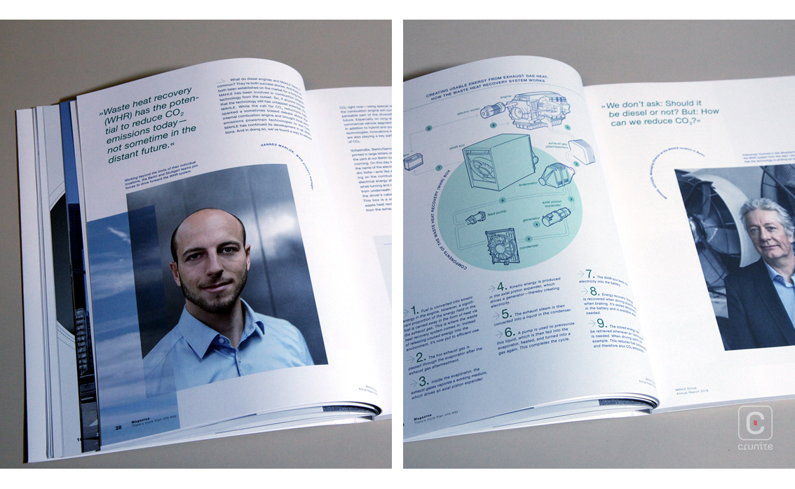
The portraiture is consistent across the board – senior and junior staff, beneficiaries and clients are all lit and photographed the same. The photographic treatment makes good use of highlights and mid-tones, favouring these over blacks. This reinforces the rest of the design – airy and light.
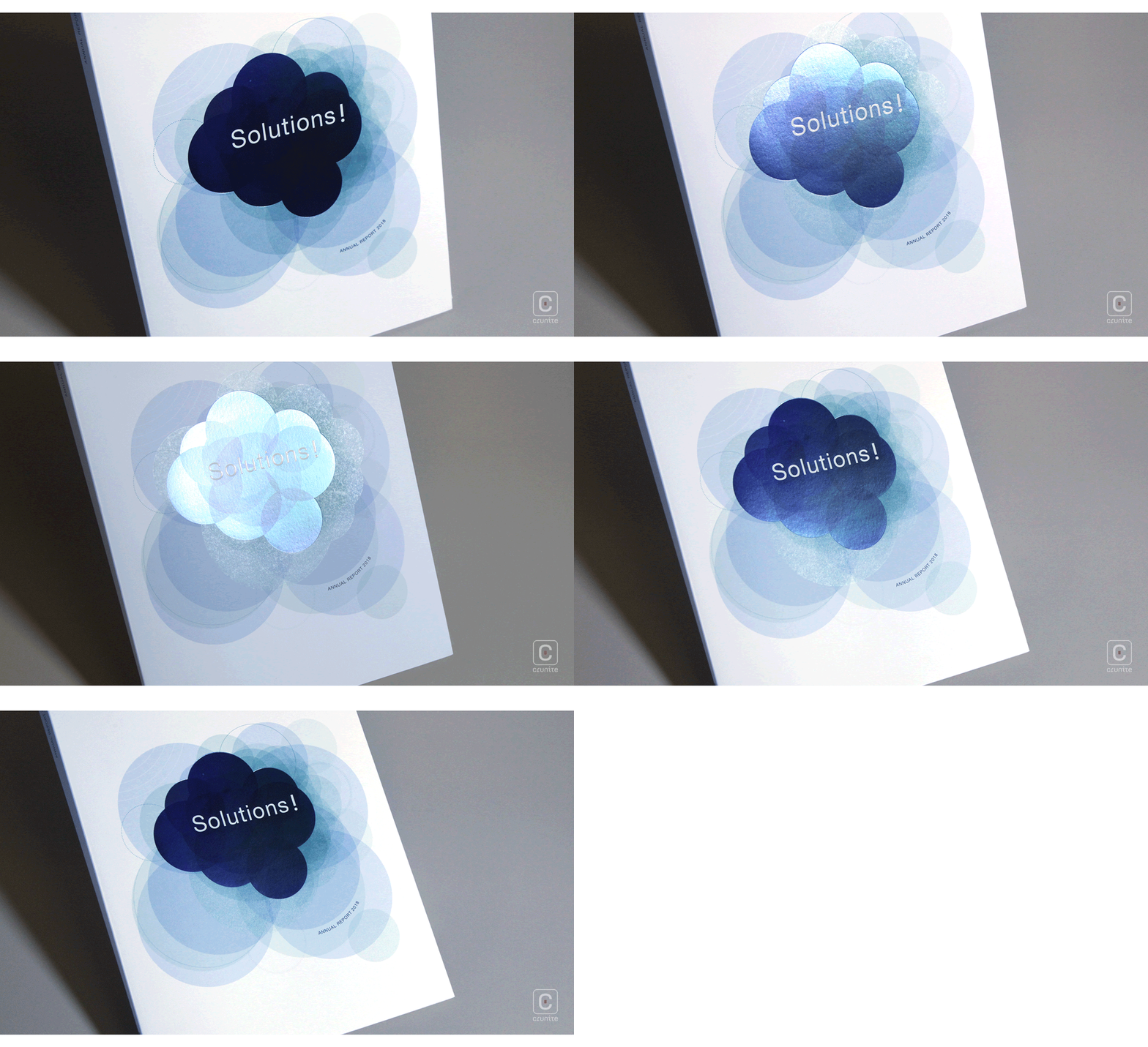
The report relies heavily on the circle as an element of design and it is used confidently in a variety of ways. Circles appear as bounding spaces for content, background colour fills and sometimes as guides for text. When used as a textual element in particular, they add a jaunty flourish to an otherwise staid design.
Where this report shines is in its use of infographics. Most reports use infographics to convey numbers or relationships. Here, the primary use is to explain individual pieces of technology or physical and chemical systems. Succinct, easy to understand 2-colour infographics are relied on to do this. Everything from electric air-conditioning compressors to how to make energy from exhaust gas heat are explored in these pages. It’s a shame more were not included.
