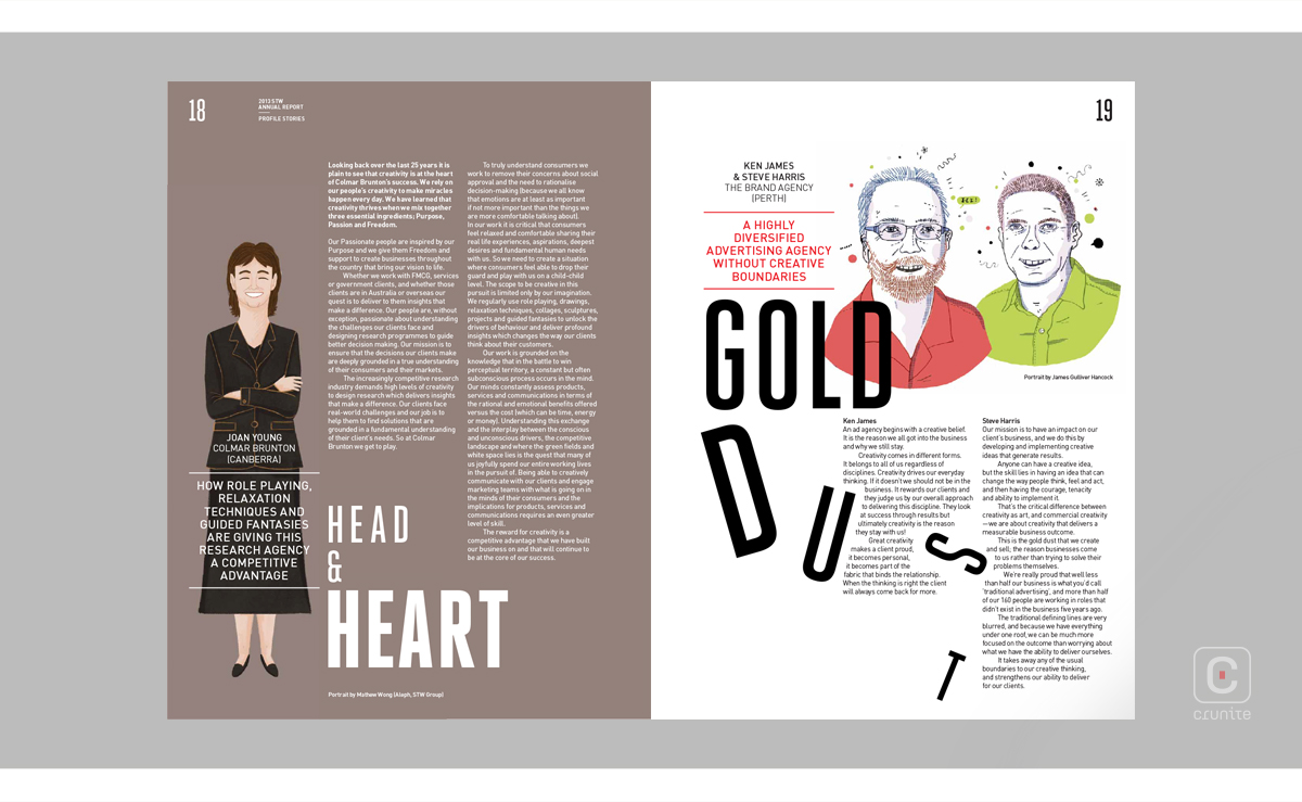
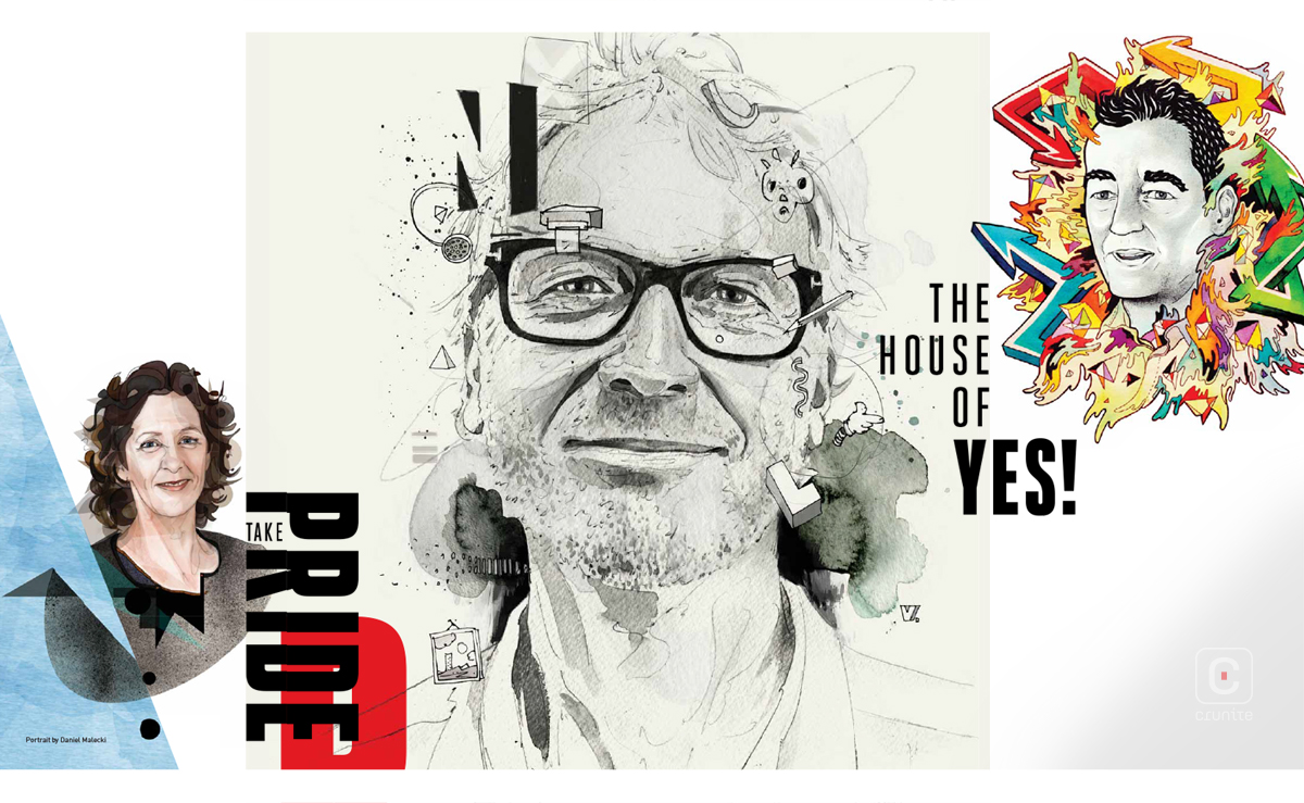
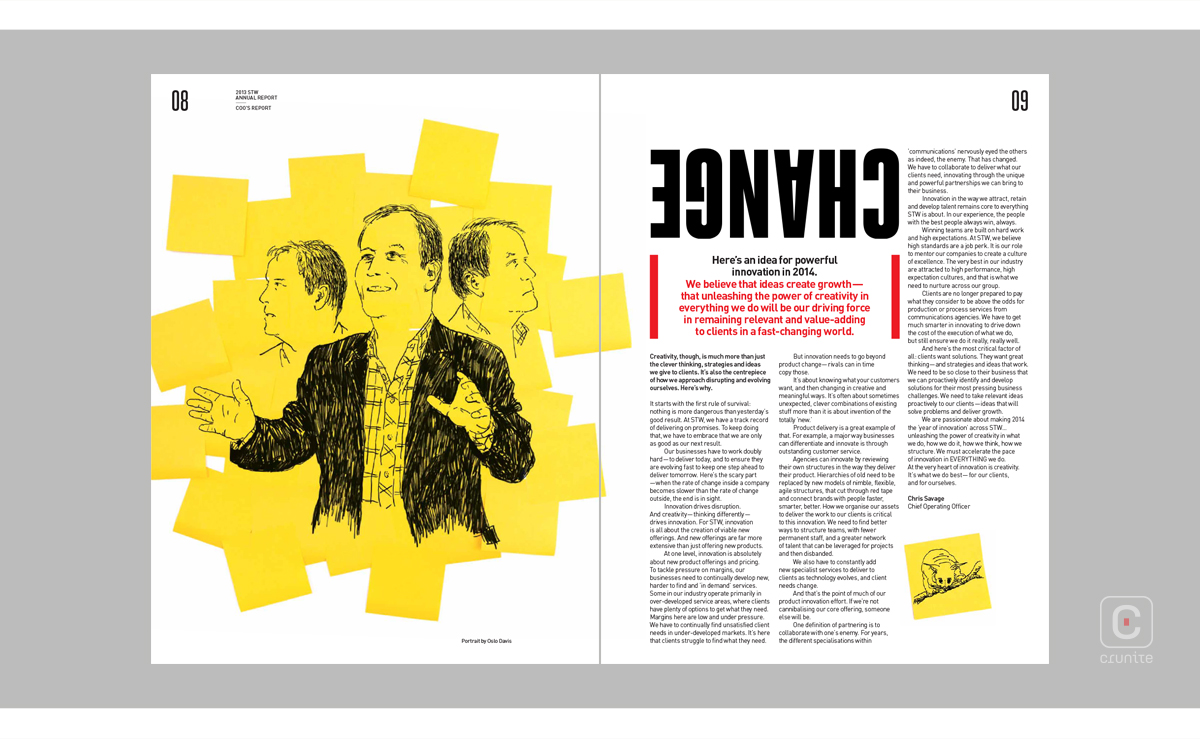
The STW group (now WPP AUNZ), Australia’s leading marketing and communications group, has used their 2013 annual report to showcase a number of very diverse and innovative illustration styles. These drawings are mostly portraits of prominent individuals within the companies that come under the STW umbrella.
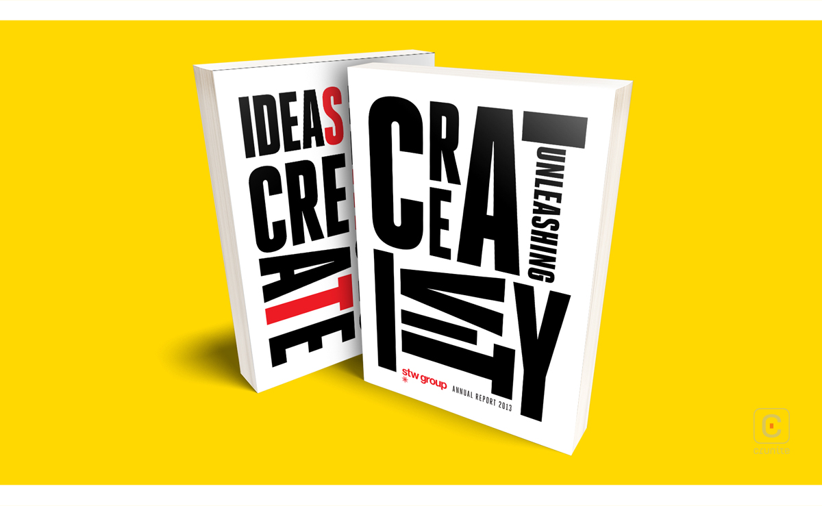
The cover page is a collage of letters, and as the report progresses, the reader is able to observe a number of similar standout typography treatments.
The use of black and red text on white is very striking, with red allowing the reader to hone in on significant information. The orientation of titles or key words on certain pages can be somewhat befuddling, but they bring in a wild creativity to the report.
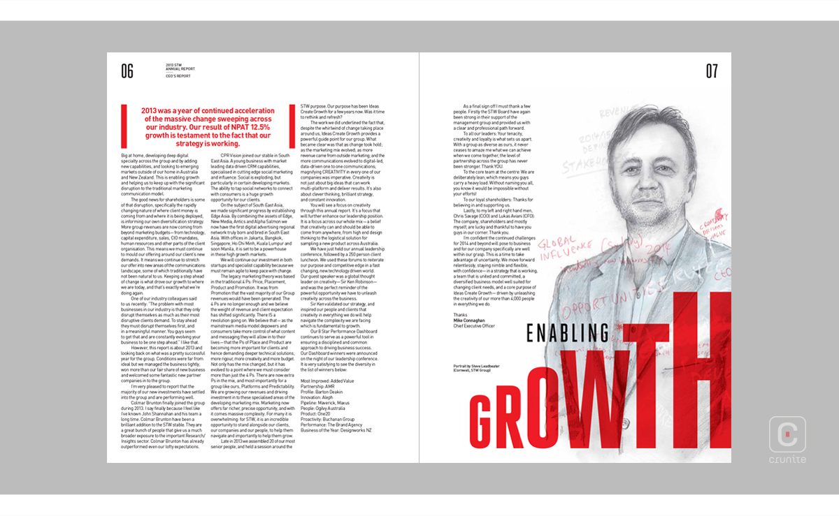
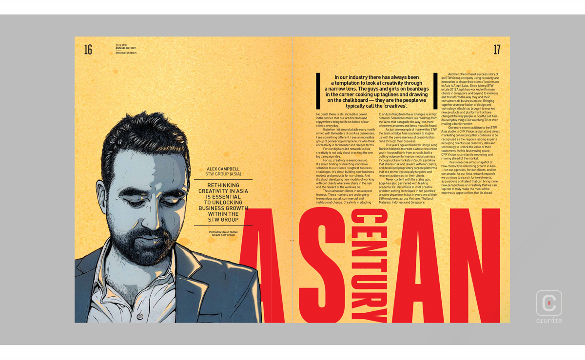
Another notable feature in the design of the text is the placement of a word within a word, most often in a ‘T’ or ‘I’.
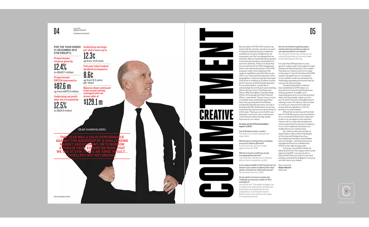
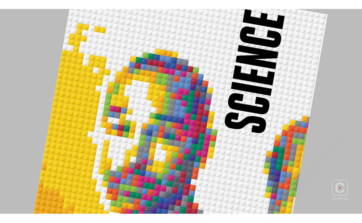
Watercolour, geometric art, graffiti, pencil drawings – even Lego inspired artwork – you name it, it’s captured in this report. Illustrations are the work of different artists, both within and outside of the company; each of them unique in their own way, bringing a special flavour to each page.
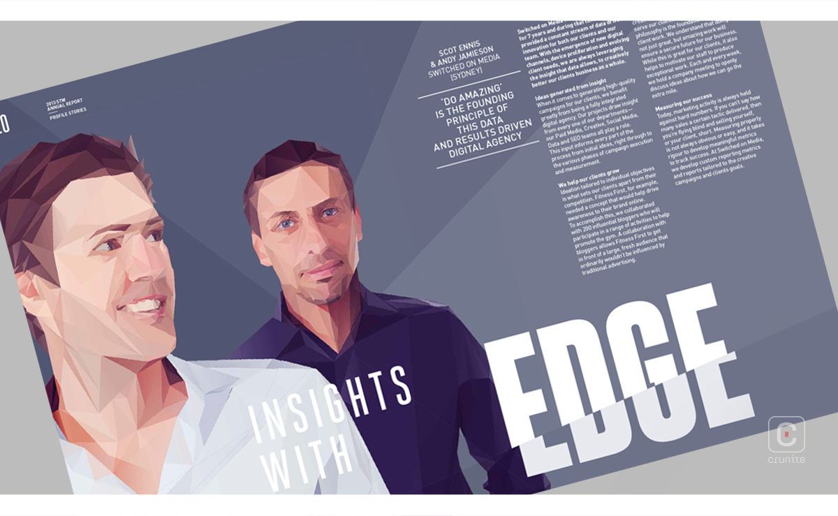
In addition to the diversity in illustration, myriad textures also emerge on different pages (16-17 for example). Truly a visual treat.
Selected pages contain collections of images that serve as a portfolio, while crediting each project to the respective creative company within the group.
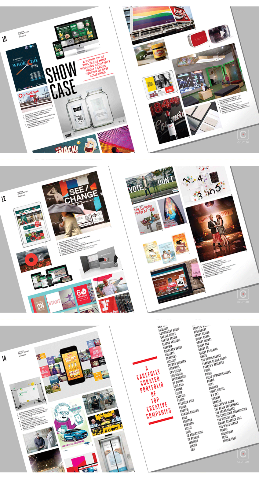
Content has been well compiled on the pages of the non-financial segment of the report; composition is pleasing to the eye and there is every reason to turn to the next page.
The red letters within the bold statement on the back cover subtly highlight the company in closing.
