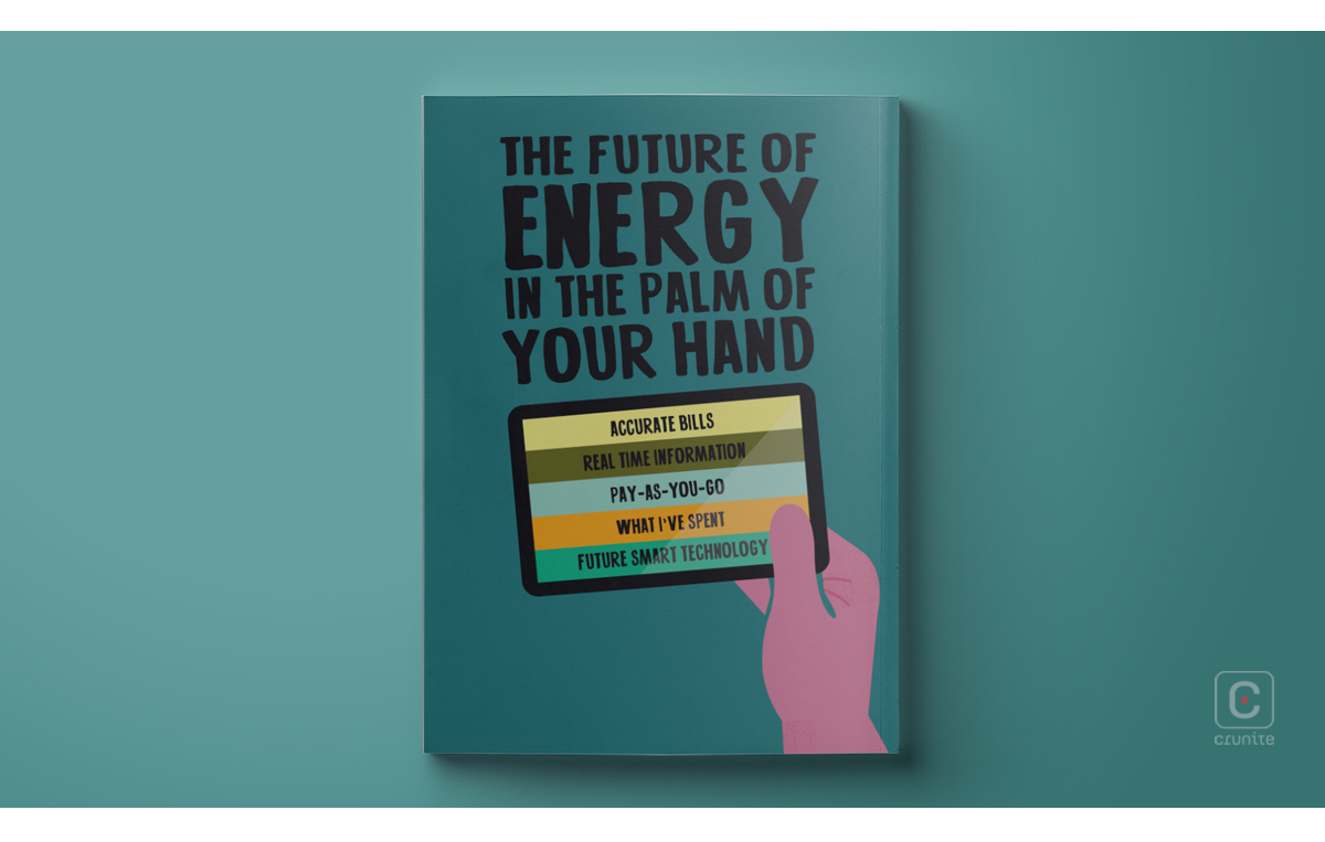
Smart Energy GB is a government funded non-profit organisation that helps British homeowners and businesses to understand how smart metres are replacing traditional gas and water metres, and how this is advantageous for the customer as well as the environment. Their 2013 annual report is a good example of creating an effective report without relying on photography.
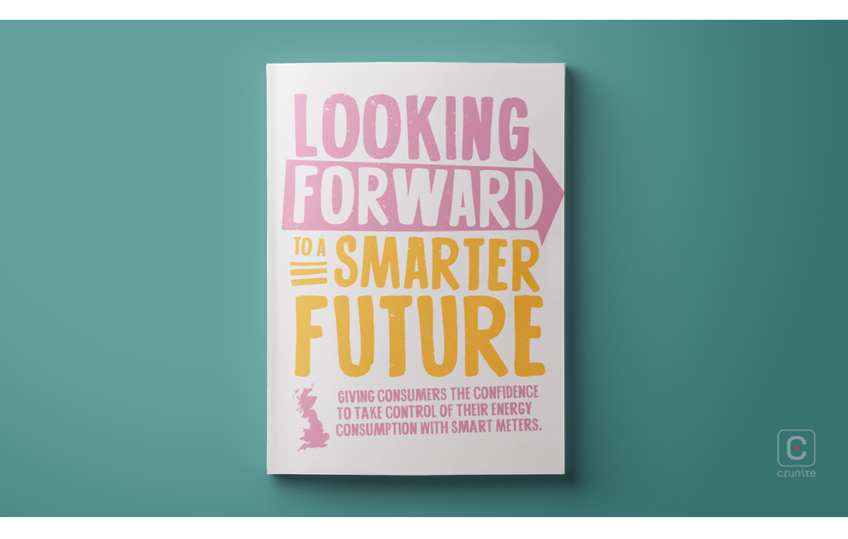
Annual reports without photography are rare. This is understandable, as photographs still carry an aura of ‘truth’ – no matter how staged and post-produced a corporate portrait is, we still see a real person on the page.
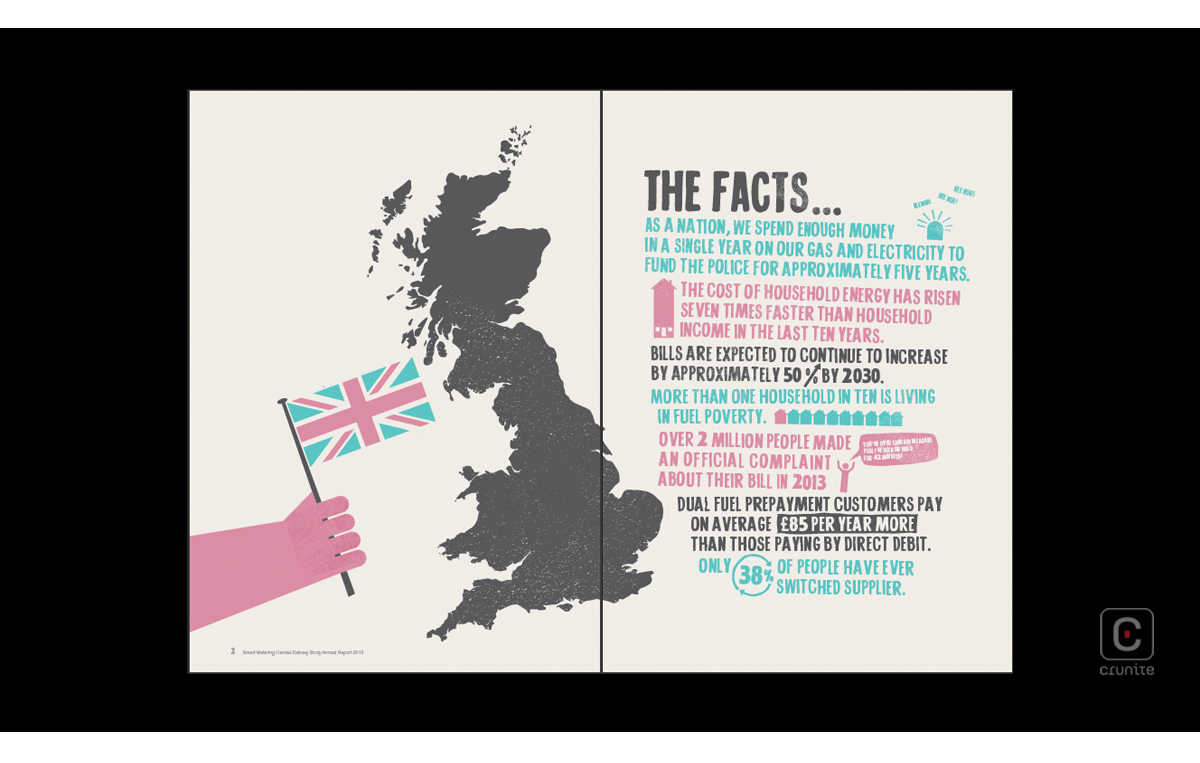
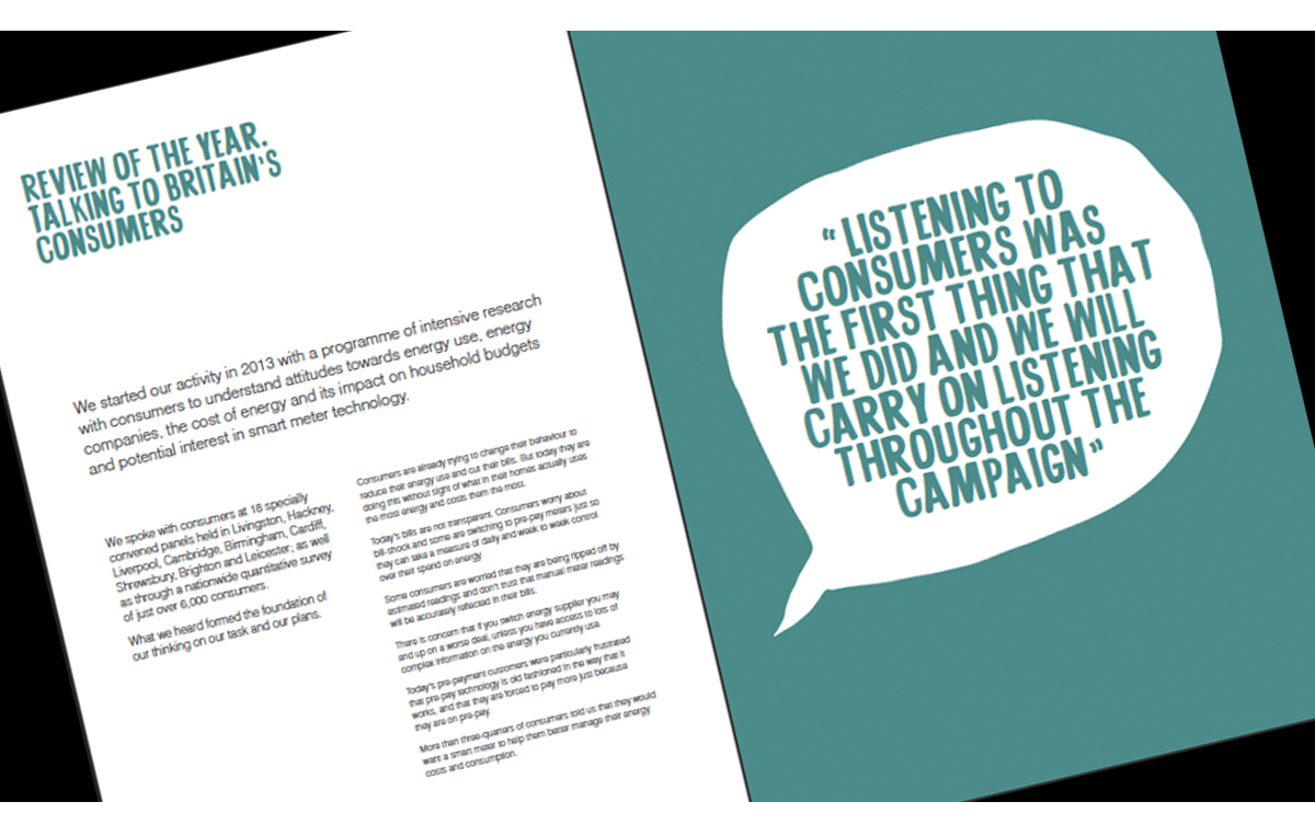
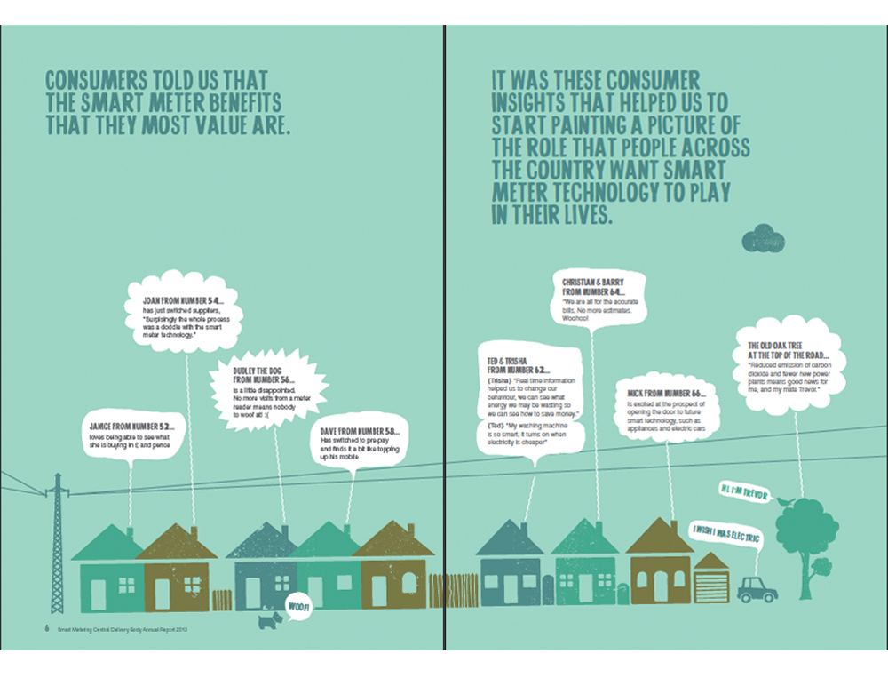
In addition, photography as a means of depicting staff, customers, beneficiaries, buildings and equipment tends to be faster than commissioning and executing good illustrations. The result is fewer annual reports that use solely illustration.
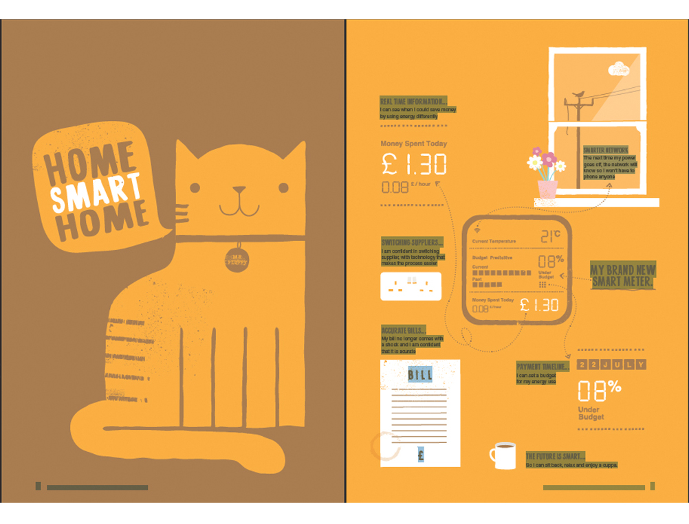
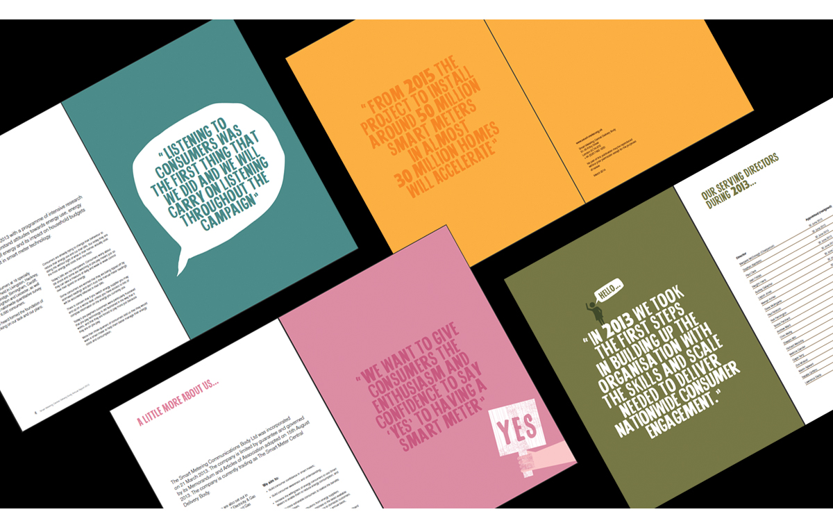
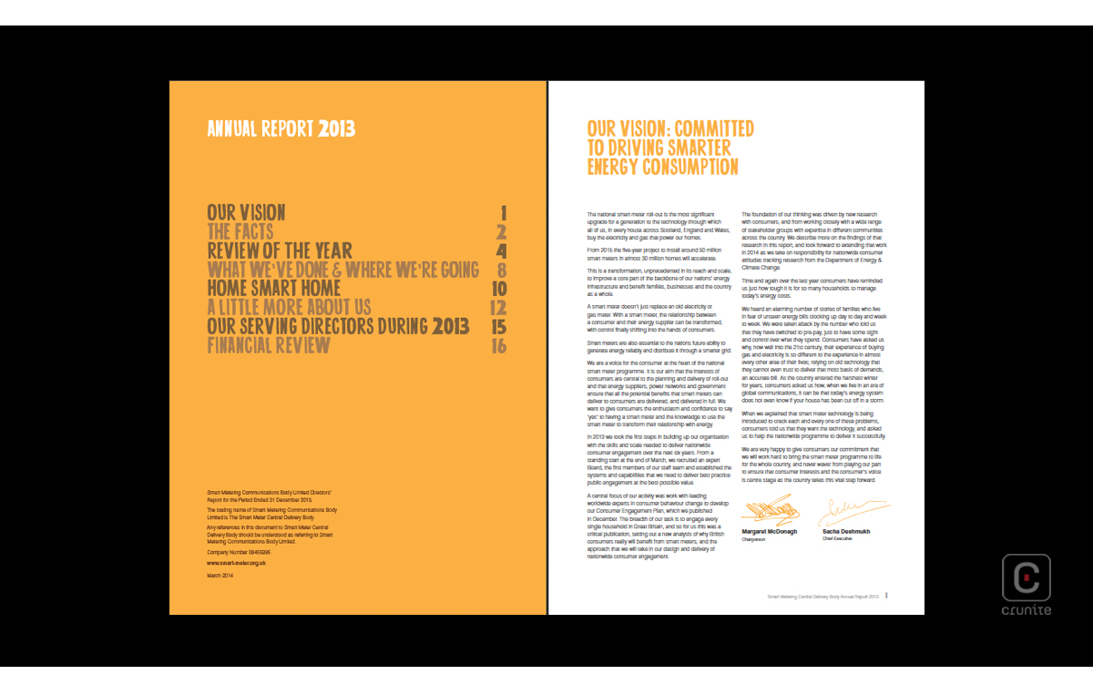
Smart Energy GB’s approach to pure illustration relies on a jaunty ‘hand-drawn’ typeface whose line and energy perfectly complement the simple illustrations and muted but still cheerful colour palette. The casual, friendly tone of the copywriting also adds to the overall effect. It helps as well, that the report bravely avoids portraits altogether and that it is quite short – at 26 pages the reader hardly has time to miss the comfort of photographs.
