Originally a Croatian tobacco company dating to the late 1800s, the Adris Group was privatised in 2003 and expanded its focus. Today it is a large conglomerate that works in the food, insurance, hotels, and tourism spaces.
Adris Group’s 2012 annual report is an elegant document, constructed with a wise eye to typography and illustration.
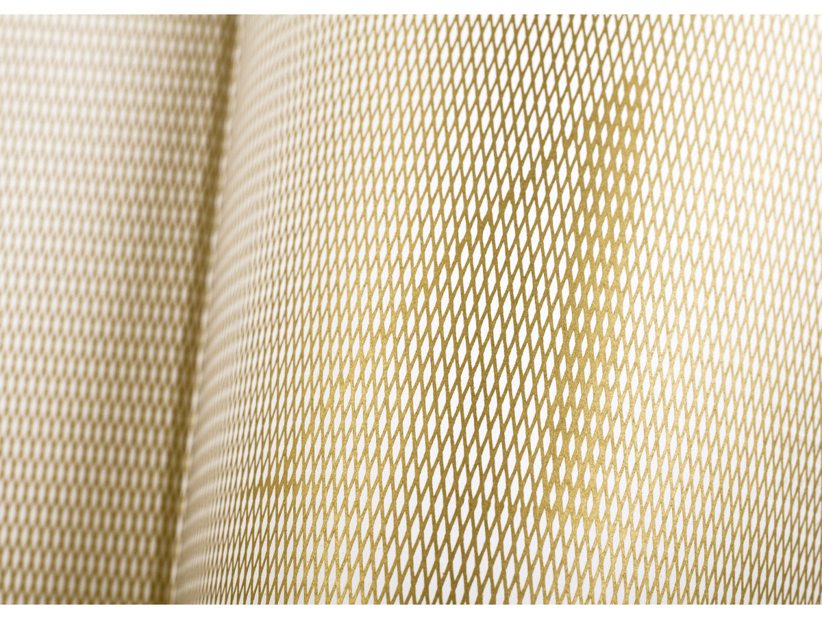
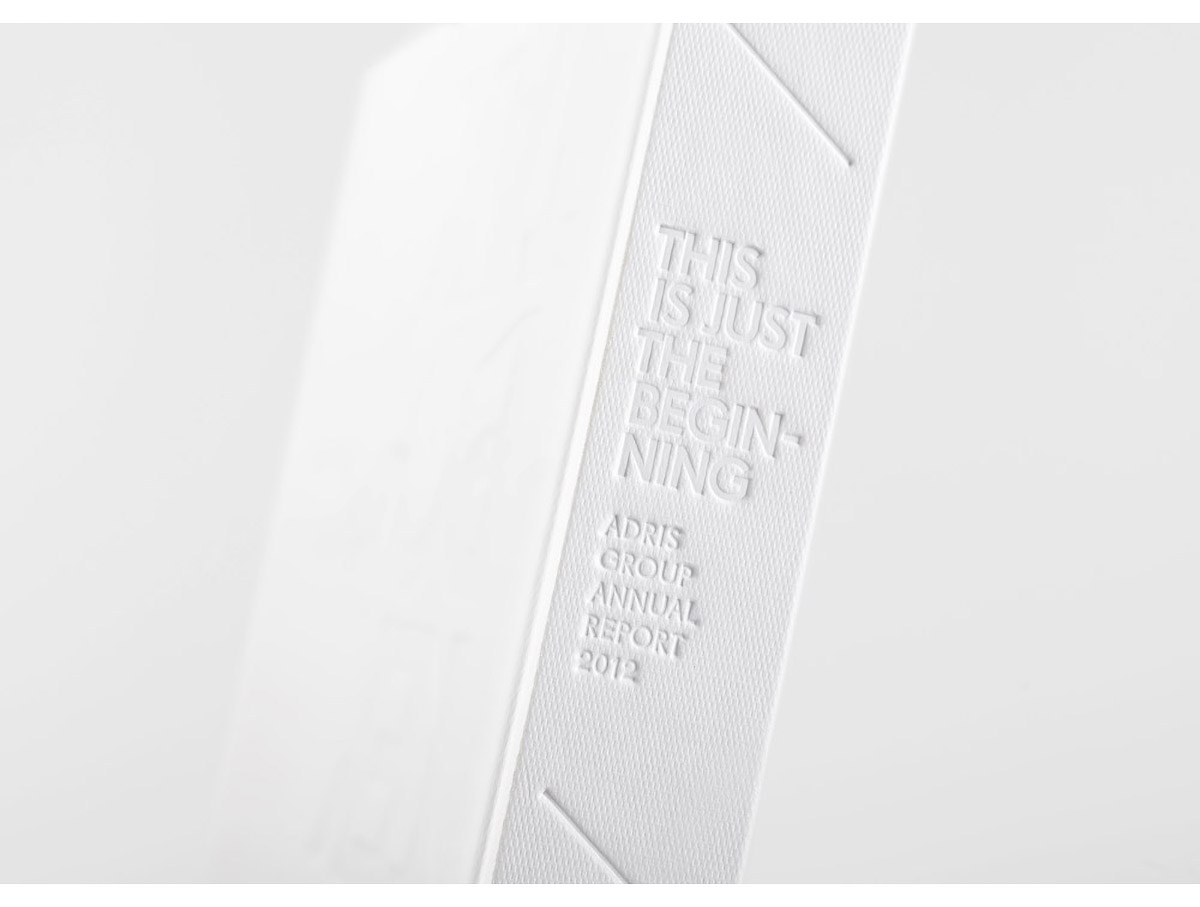
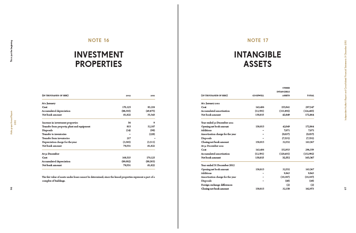
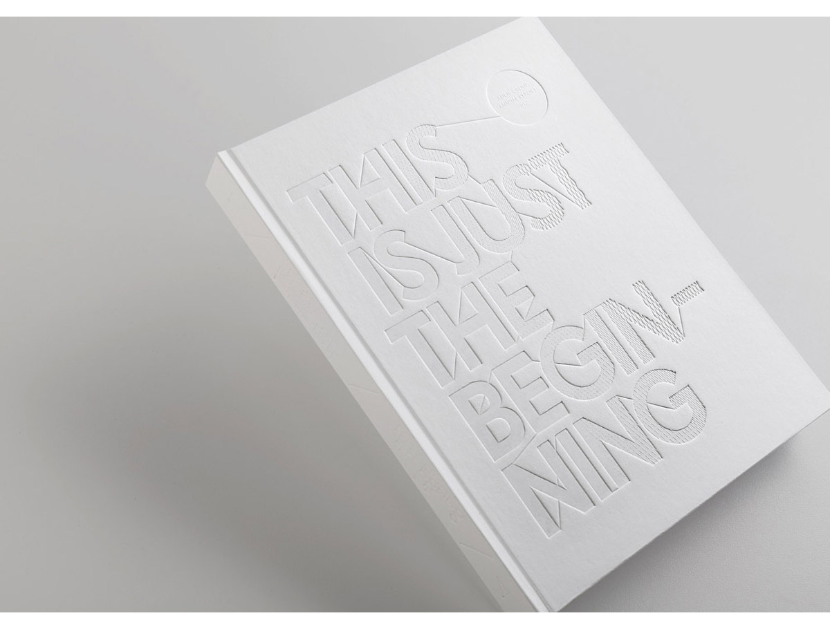
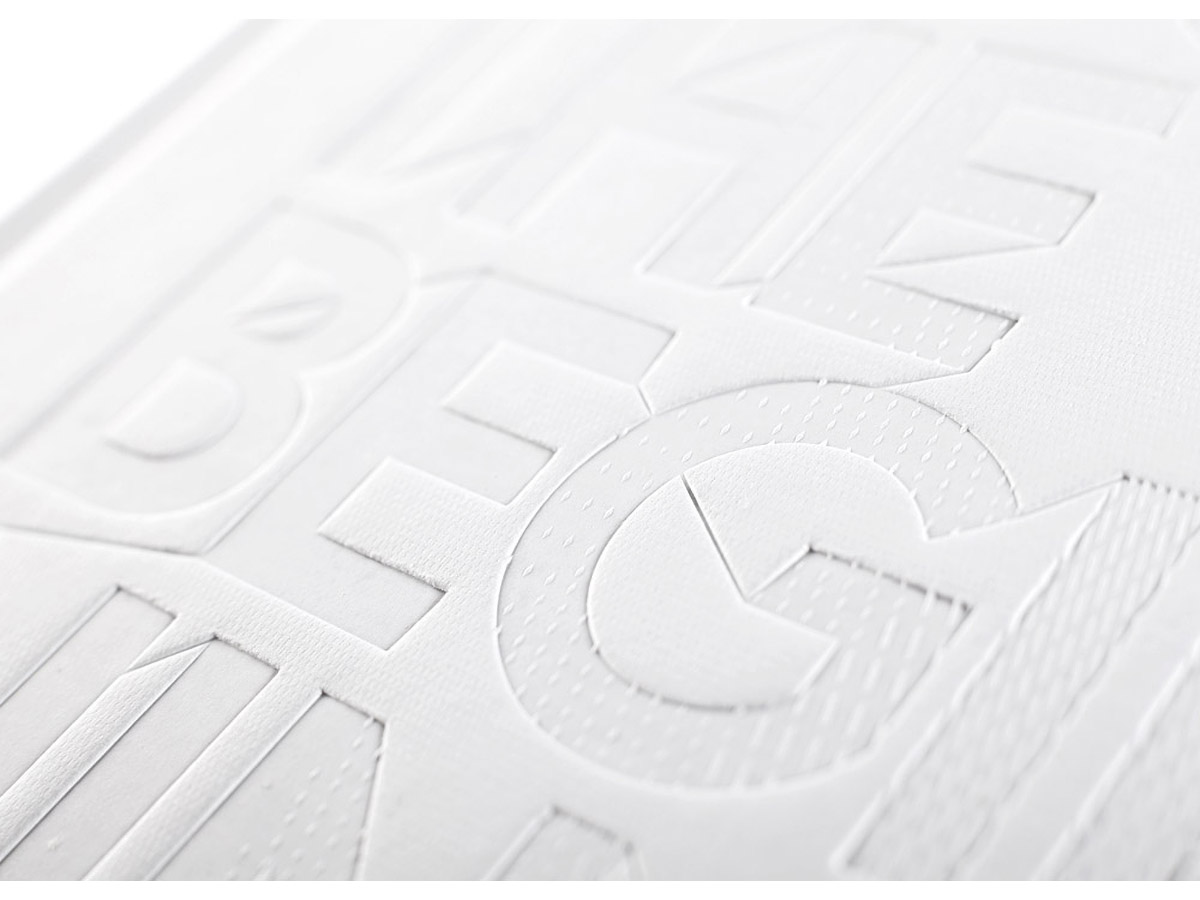
The design by Bruketa&Žinić OM gets off to a lovely, restrained start with an entirely white hardback featuring a die-cut title. The sense of space created by the cover is carried through the page design, with almost extravagant negative space, balancing the delicate serif typeface and its partner, a weighty sans serif.
The report, unusually for annual reports, begins like a book—by crediting the people who created it. It’s a refreshing change to see creatives given pride of place in an annual report.
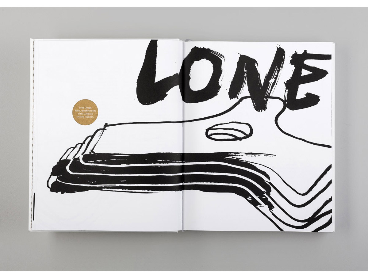
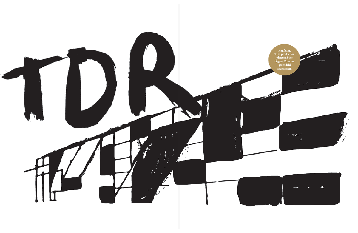
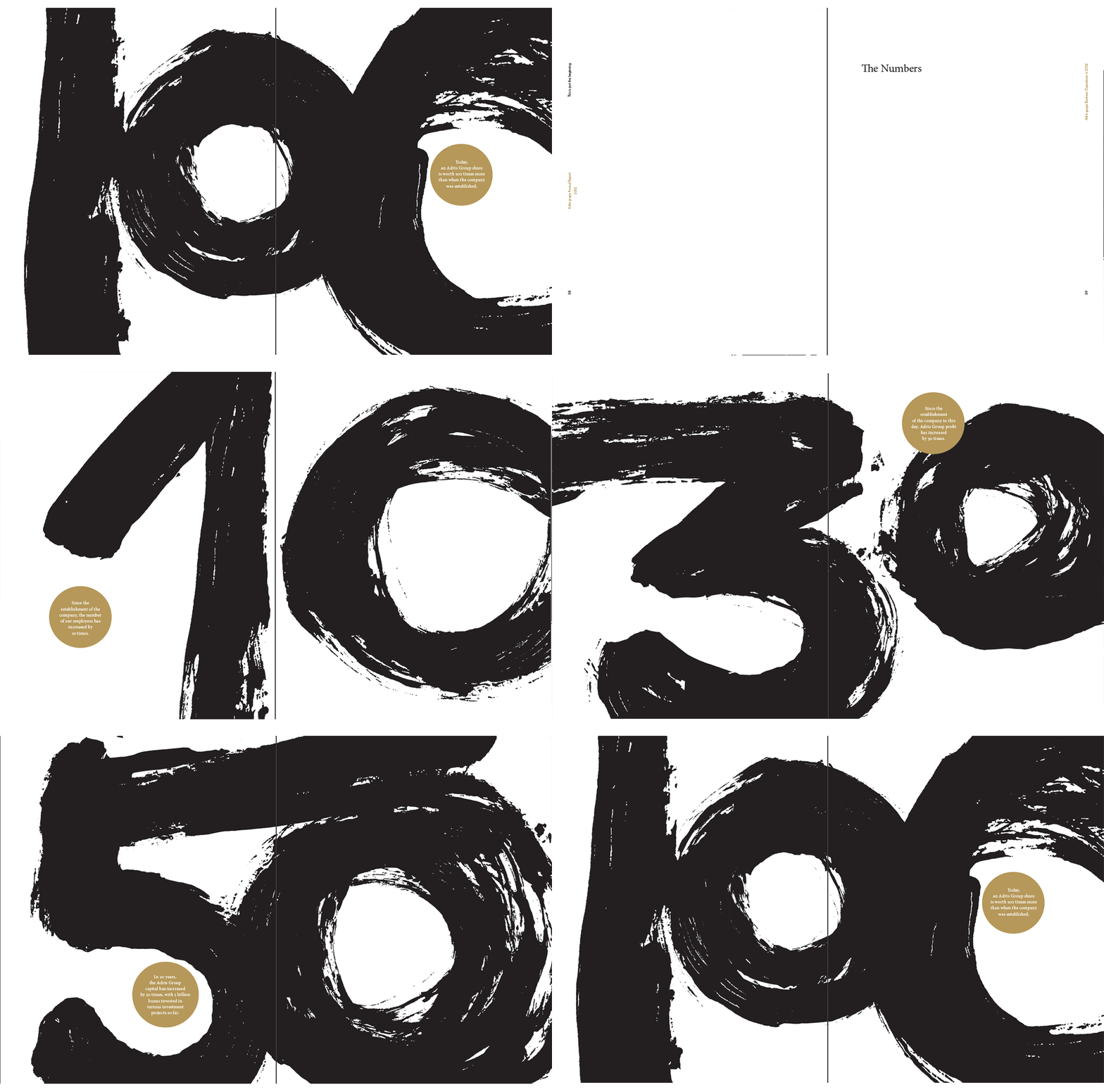
This report is a fine example of a 2-colour palette used well. In addition to the indispensable black ink, the designers rely on a matte gold ink to add colour, provide navigation cues, and for emphasising important aspects of the text.
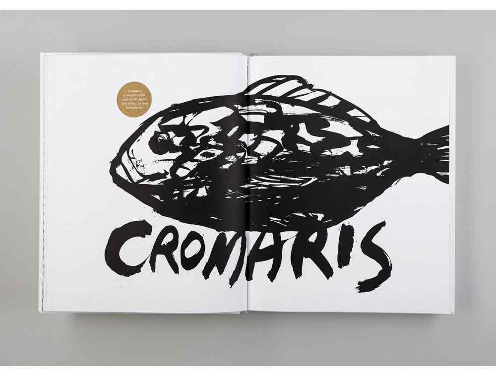
The report has no photographs (another rarity). Instead, it uses black illustrations in a painterly hand—and a swift, energetic painter, at that—to create a sense of vitality in what might otherwise have been a staid document.
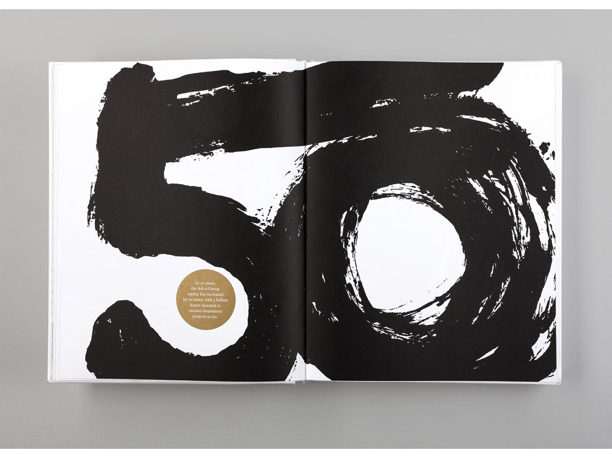
With a limited set of tools Bruketa&Žinić OM have created a noteworthy annual report. This is one worth studying, as it amply proves you don’t need a lot to do a lot.
