The Melitta Group is a German family-owned business. They work internationally, supplying retail coffee and coffee preparation products (coffee filters, machines and so on). The original company was founded in 1908 by Melitta Bentz, the inventor of the paper coffee filter.
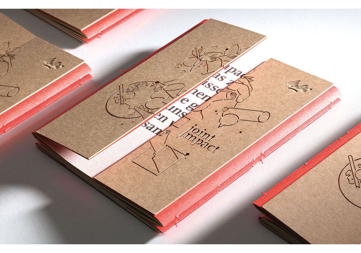
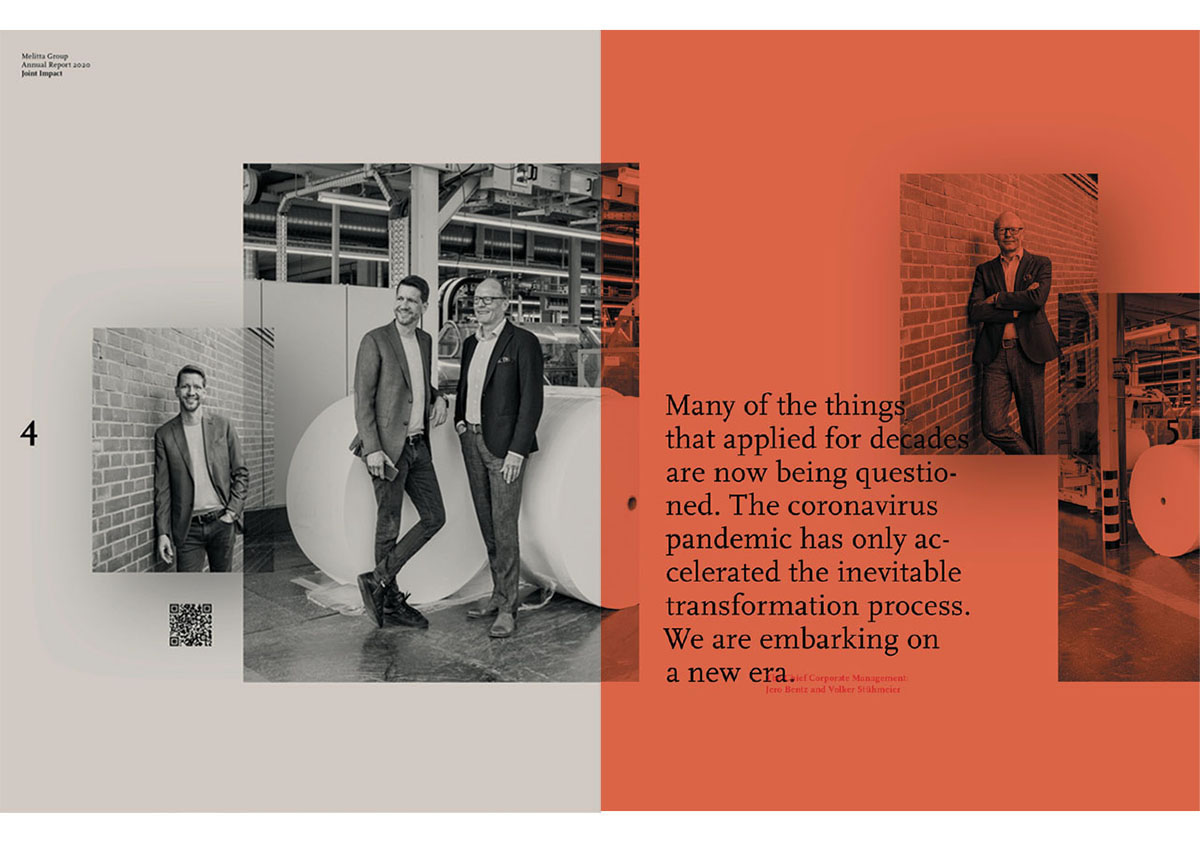
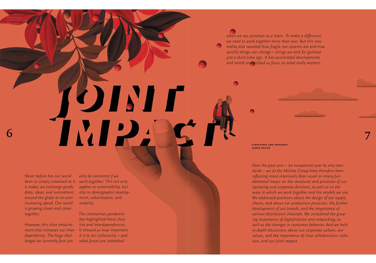
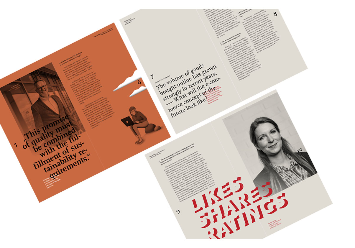
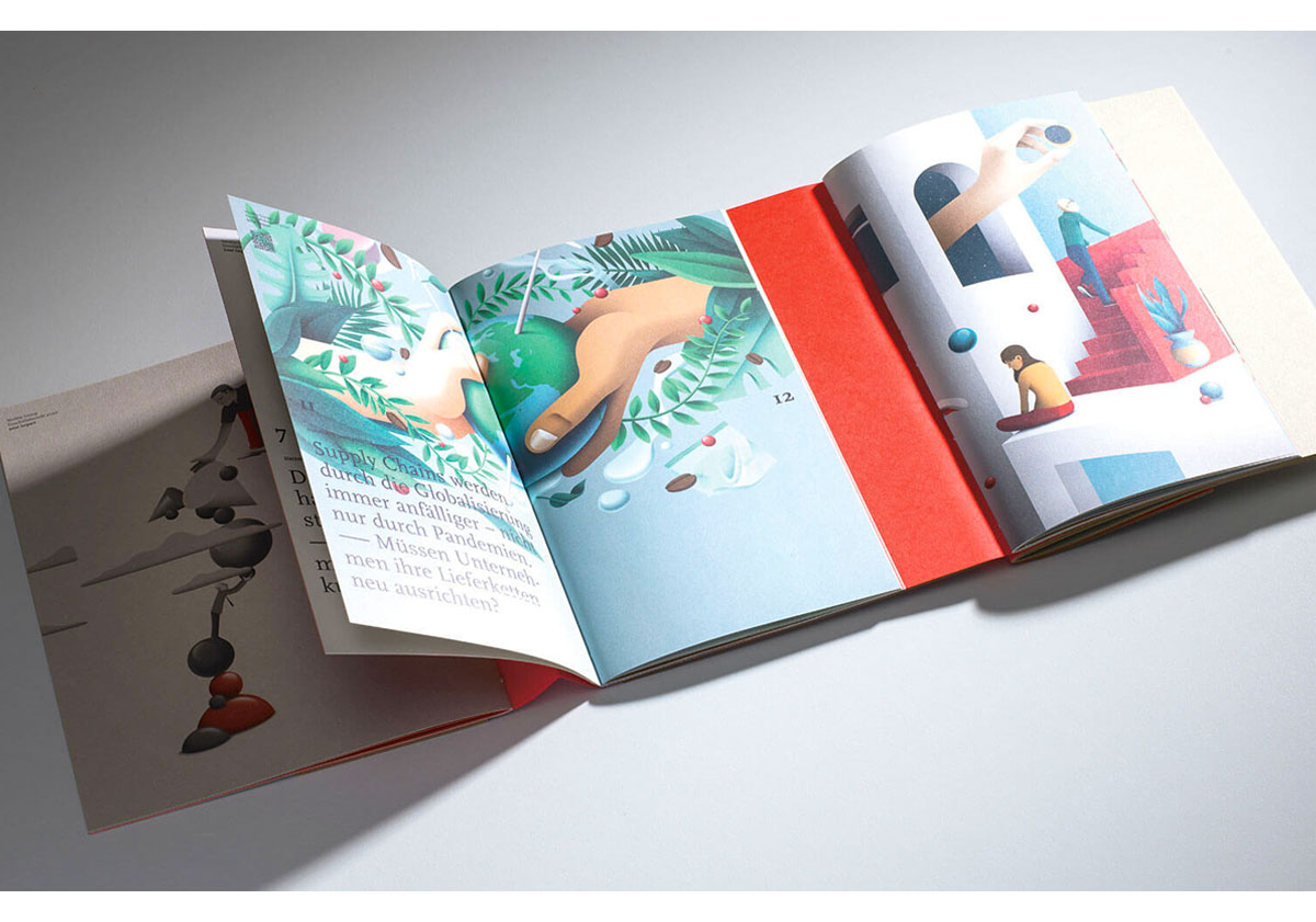
This report has much to recommend it – specifically in how it handles colour and illustration. In terms of colour, there isn’t a single white page in the report (about 108 pages). This is a bold choice and it works well. Colour overlays are used on every page, with the white of the paper showing through rarely – as an occasional highlight in the text or illustration. The overlays work particularly well on the black and white portraits of employees. The colour palette of the overlays is muted and soft, setting a gentle tone for the report.
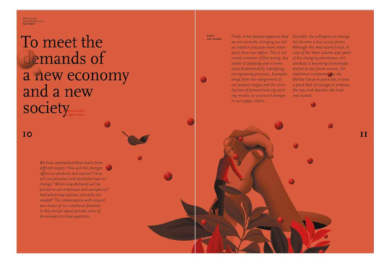
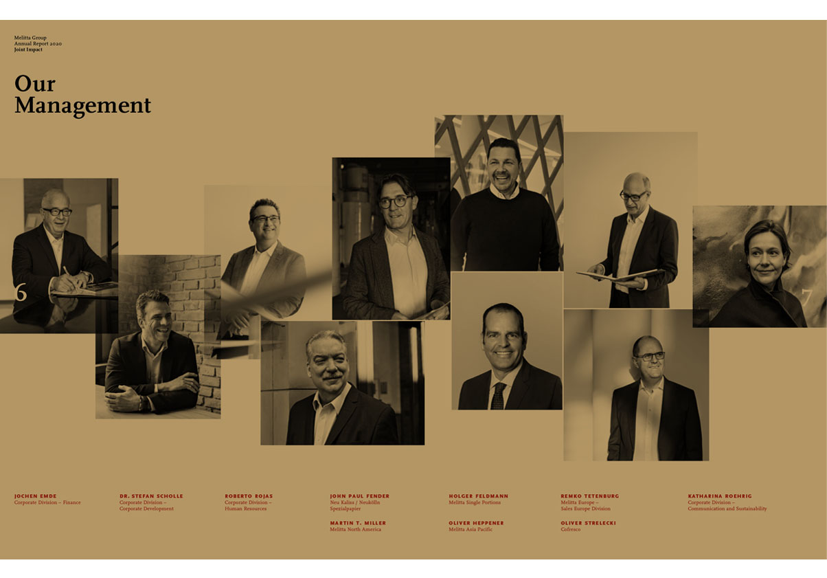
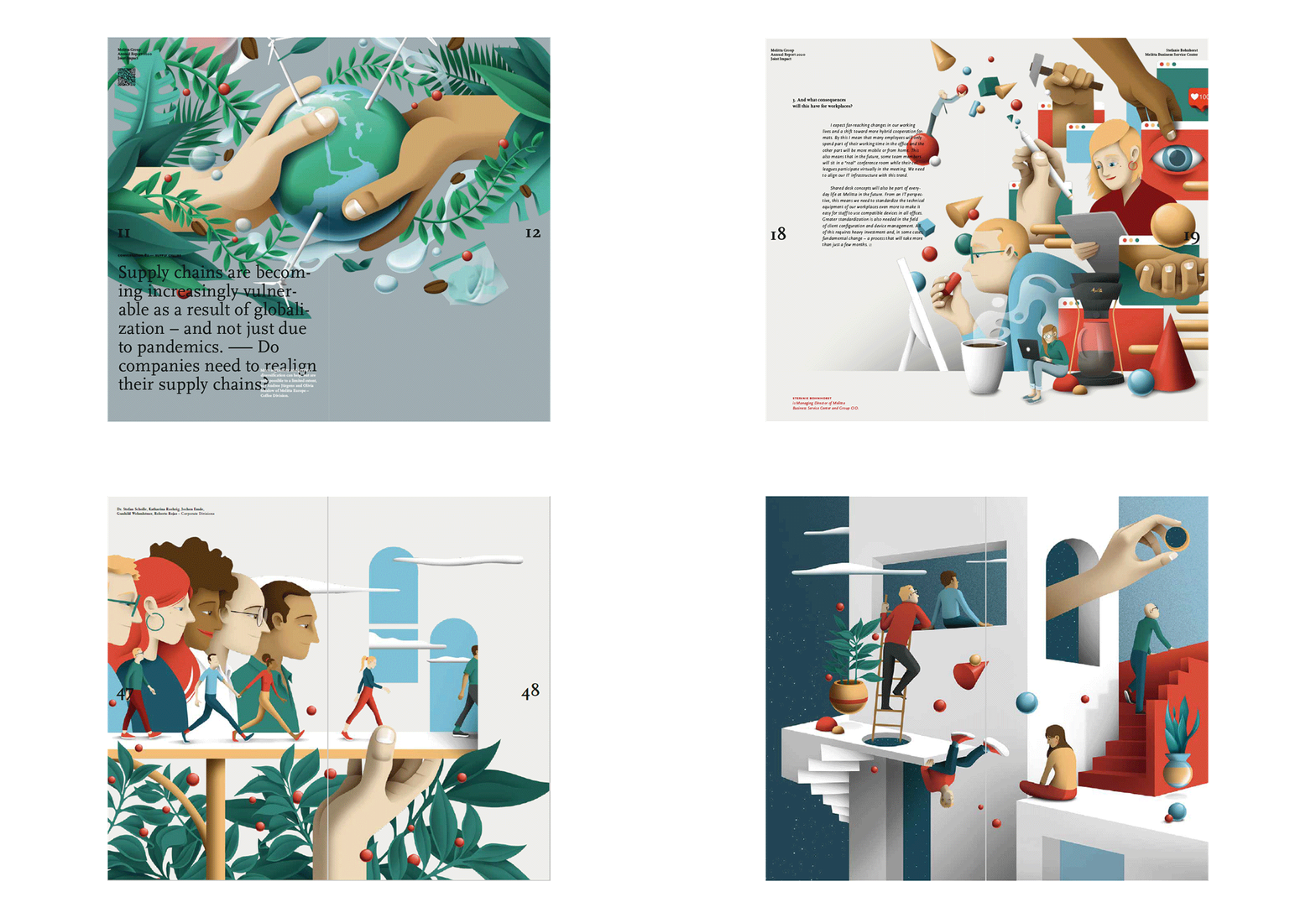
This tone is emphasised by the illustrations. Created by Spanish duo, DAQ, the images have a calm stillness to them, even when the subject of the illustration is in motion. Many of the illustrations sit under the colour overlay. In rare instances the illustrations lack a colour overlay and these stand out like beacons, helping navigation.

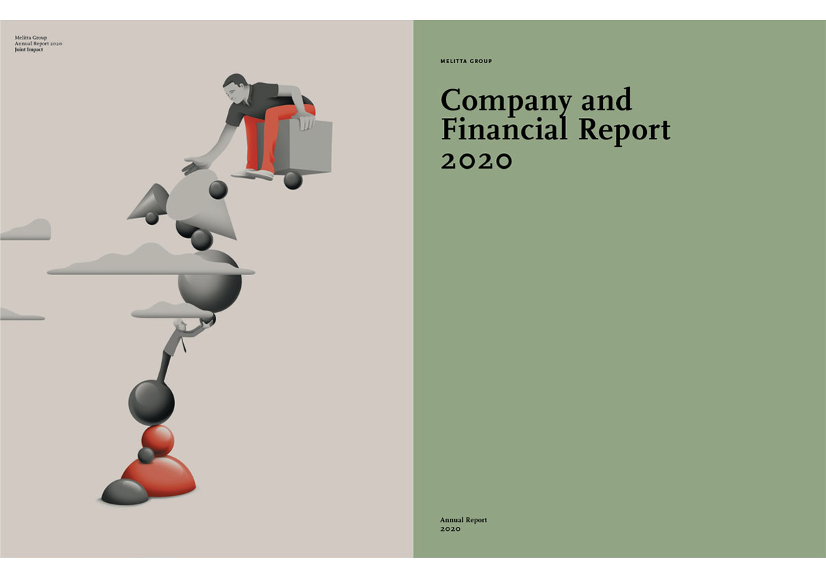
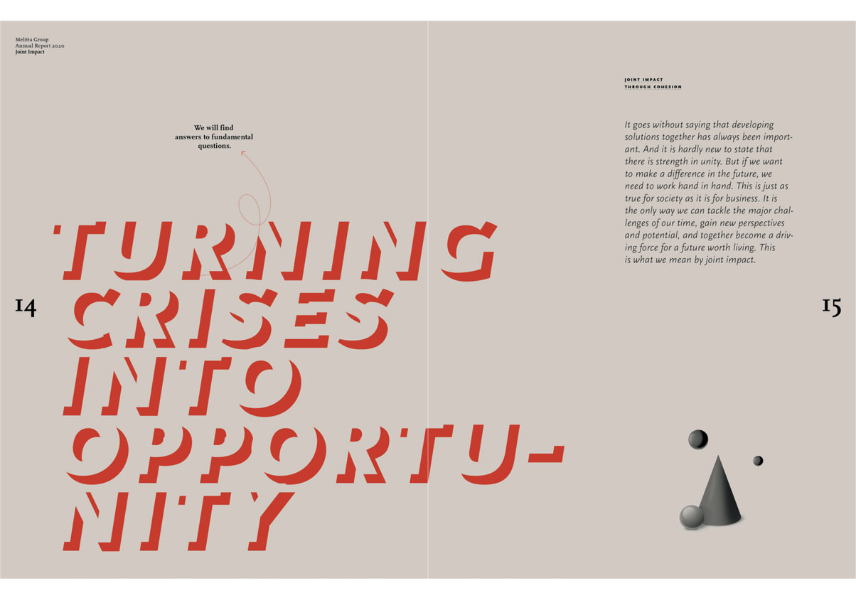
The report makes use of two paper sizes. The latter half of the report uses a narrow page dimension and the page grids works better here than in the first half. Type treatments are unobtrusive except when text is force-justified or overlaid with other text. Page numbers use a large serif, set midway down the outer edge of the page. It’s an unusual choice in that the page number can often be the most obvious element on a page, but it anchors the design. By dividing the page in two it also reflects the company’s message of togetherness and equality.
Opting for a colour overlay on every page is risky – it means balancing every element of design very carefully with the illustration (and print). Melitta’s 2020 report shows it can be done, and done well.
