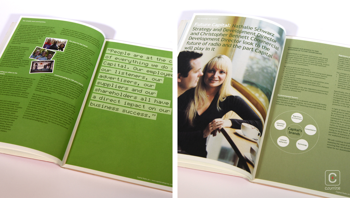
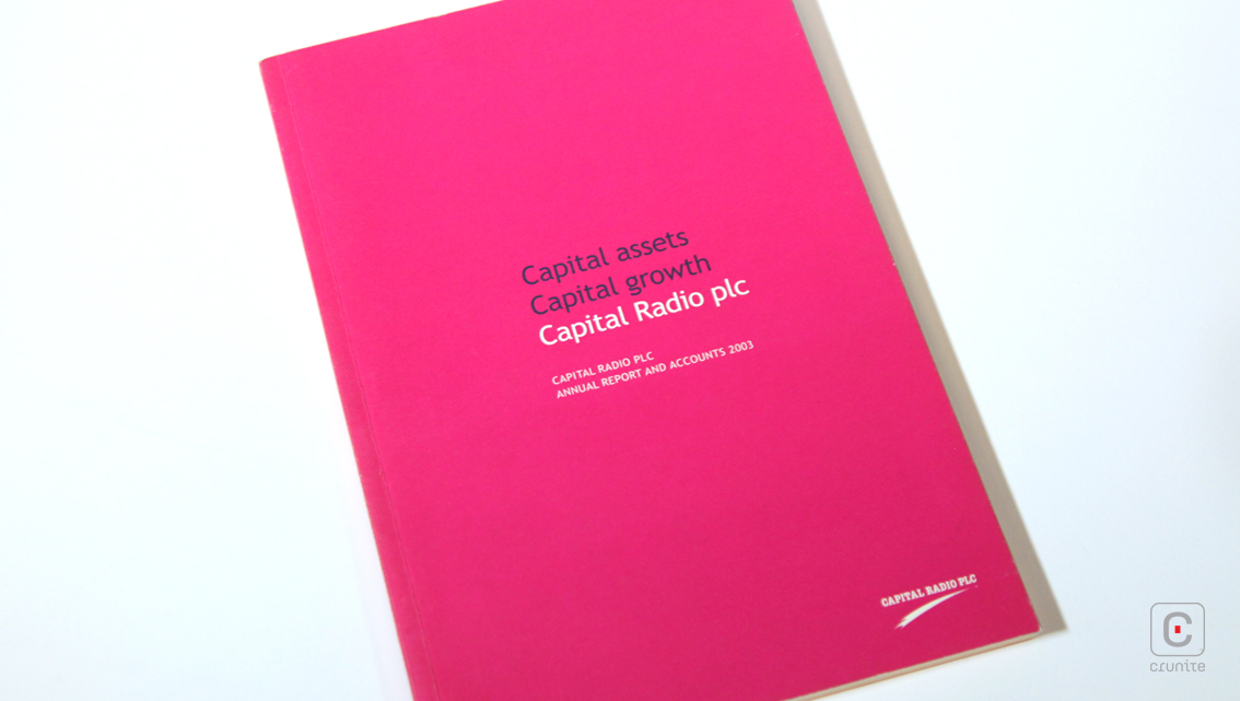
Capturing the largest metropolitan audience of any radio station in the world, Capital Radio PLC has taken on a life of its own. Their bohemian personality beloved by many across the globe is evoked through exuberant colours, editorial photography and radio-related embellishments in their 2003 annual report.
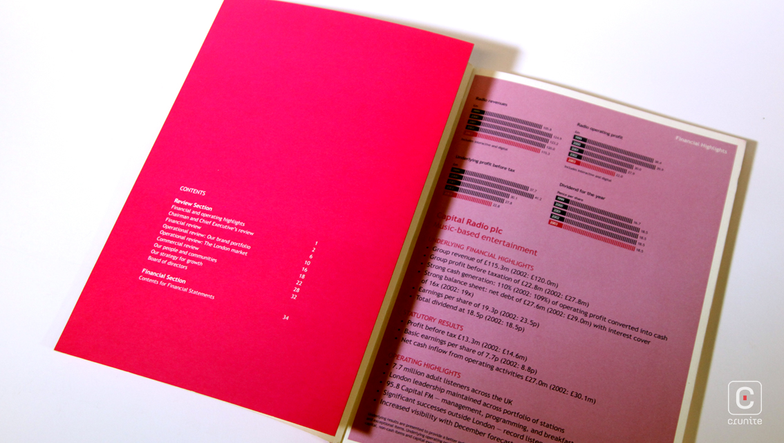
The report’s contents page, found unconventionally behind the cover, is written in the same white font that continues throughout. The quirkiness doesn’t stop there; the cover page doubles as a foldable pull out and this feature sports a three page collage of England’s pop culture icons of the 70s and 80s, which acts as a header, above Capital Radio’s numerous digital brands.
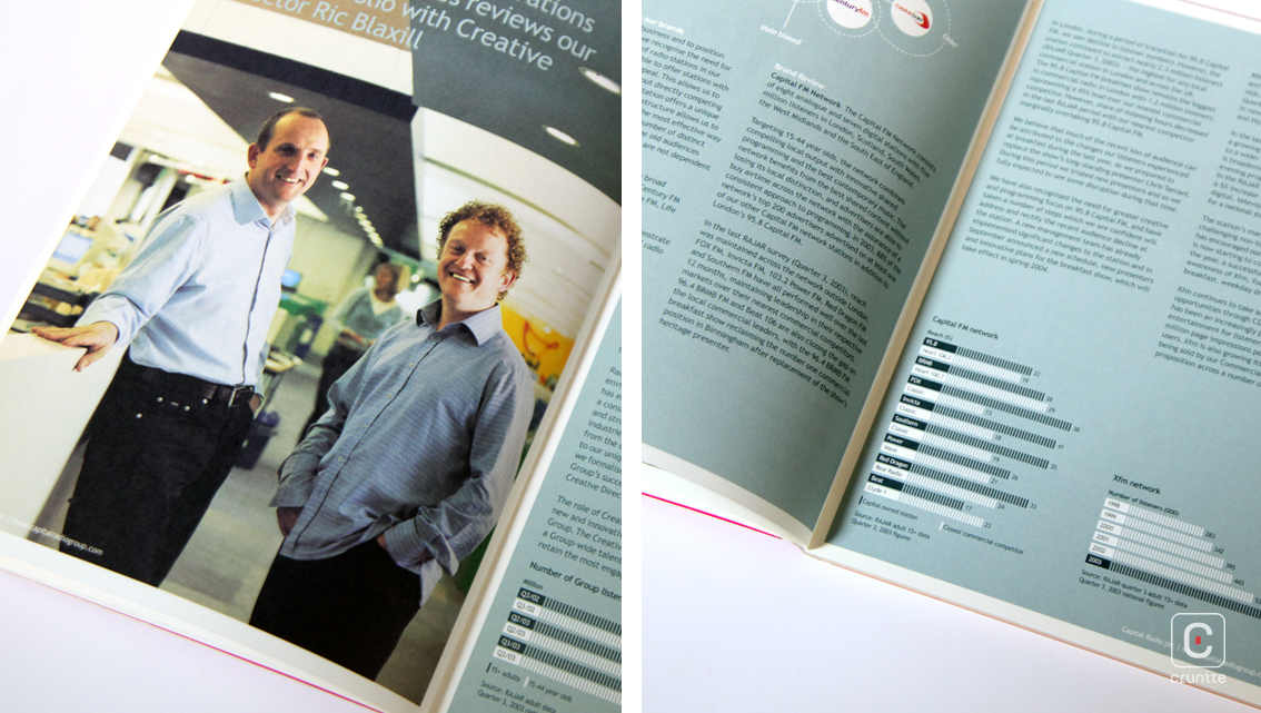
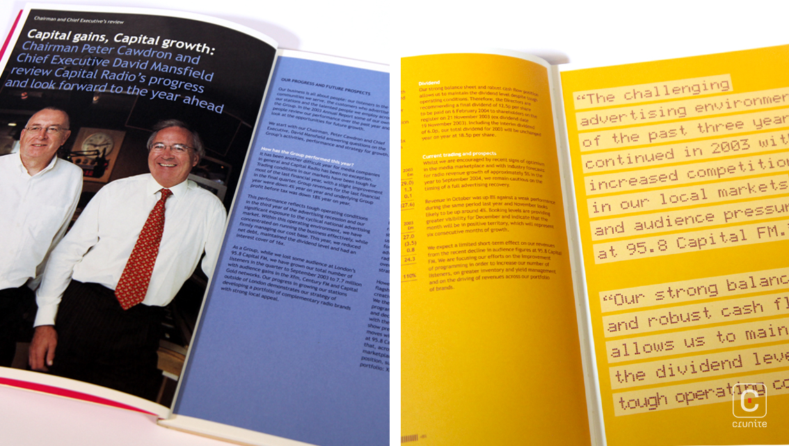
Keeping to the modest yet zany design, the report dumps the usual orthodox white for vibrantly coloured pages with thin white borders. Information blocks take on a darker shade of their main page colour with white headings, headers, footers and page numbers. The content that gives readers a 360° view of the group, is presented in two neat columns of short paragraphs. The information, written in first person perspective using colloquial English, sounds as if it’s being reported live on air.
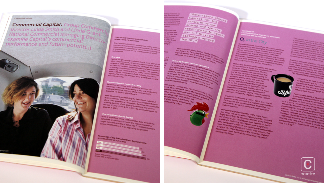
Although photography is sparse, it is what truly brings the content to life. Each section begins with a laid-back full-page image of people who play a major role in the success of Capital Radio, at work or running errands. Further, section headings appear at the top of each image with a short description. The novelty of this is that the people, backgrounds and text of each shot subtly match the main colour scheme of their corresponding section and tell a different story. The Board of Directors is captured as a three tiered collage of relaxed pictures with a corresponding numbered diagram and individual descriptions. To top it all off, smaller cut-out images appear sprinkled amidst the account and wrapped in text.
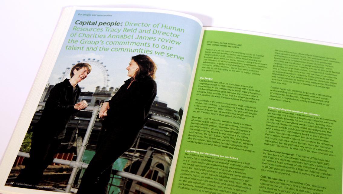
All in all, Capital Radio report combines corporate information with quirky design and showcases their personality effectively.
